
How to Use the "Go to Wishlist Button" Snippet
Legacy article. Please refer to the new updated version here
- More reliable header icon and counter
- Smaller file - markup only, no JavaScript inside
- Stays in sync with the Header Link app block
- You can hide the icon from guests (
visibility: 'logged_in_only') - Text next to the icon is no longer supported (icon and count badge only)
- Accessible name uses one simple theme translation key
The wl-go-to-btn snippet renders a heart-icon link that takes customers to your Wishlist page. It optionally shows a live item count badge. This guide walks you through adding it to your theme from scratch — no coding experience needed.
Step 1 — Open your theme code editor
- From your Shopify admin, go to Online Store → Themes.
- Find your active theme and click the ··· (three-dot) menu next to it.
- Select Edit code. The code editor opens.
Step 2 — Add the Wishlist page link
In the App Embeds, open the Wishlist helper block. The block should be enabled. Add the Wishlist page to Link button URL. Press Save.

Step 3 — Add the Snippet File
In the left sidebar, open the Snippets folder and create wl-go-to-btn.liquid file . This file will contain the button component. Copy snippet code from this article and paste it to the file. Press Save.
Step 4 — Choose where to add the button
The most common placement is the header, so the wishlist icon sits next to the cart icon. In the left-hand file tree, look under the Sections folder and open header.liquid (the exact name may vary by theme — it could also be called header-section.liquid or similar).
Step 5 — Paste the render tag
Find the spot in the header where the cart icon lives — look for something like cart-icon , icon-cart , or a link with cart in the class or href. Add the snippet render tag immediately before or after it:
{% render 'wl-go-to-btn' %}
That's the simplest form — it uses all default settings. Save the file and preview your store to confirm the heart icon appears in the header.
⚠️ Important — Conflict with Header Link Block
If you have already added the Header Link Block via App Blocks (the built-in wishlist button block), do not add the
wl-go-to-btnsnippet as well. Having both on the same page will cause duplicate buttons to appear and may lead to incorrect behavior — such as the badge count not updating or the link not working as expected.Use one or the other:
Header Link Block — easier, no code required; configure it in Online Store → Themes → Customize → Header → Add block.
wl-go-to-btnsnippet — use this only when you need custom placement or styling that the block doesn't support.
Step 6 — Customize with parameters (optional)
You can pass parameters to control how the button looks and behaves. Here is a full example with every parameter shown:
{% render 'wl-go-to-btn',
  icon_color: '#e53e3e',
  text_color: '#333333',
  icon_size: 24,
  icon_size_mobile: 20,
  text_size: 16,
  text_size_mobile: 14,
  show_text: false,
  show_counter: true,
  count_position: 'on_icon',
  hide_counter_when_empty: true,
  count_bg_color: '#e53e3e',
  count_text_color: '#ffffff',
  count_size: 18,
  count_size_mobile: 16,
  count_font_size: 10,
  count_font_size_mobile: 10,
  icon_text_gap: 6,
  margin_top: 0,
  margin_right: 0,
  margin_bottom: 0,
  margin_left: 0,
  max_width: 0
%}
You only need to include the parameters you want to change — anything you leave out falls back to its default value.
Parameter reference
Icon
| Parameter | Default | Description |
|---|---|---|
icon_color |
#dcdcdc |
Color of the heart icon. Accepts any valid CSS color value (hex, rgb, hsl). |
icon_size |
20 |
Icon width and height on desktop, in pixels. |
icon_size_mobile |
20 |
Icon width and height on mobile (screens under 768 px), in pixels. |
Link text
| Parameter | Default | Description |
|---|---|---|
show_text |
false |
boolean Show a text label next to the icon. Set to true to display the wishlist link text (pulled from app settings). |
text_color |
#dcdcdc |
Color of the link text. |
text_size |
14 |
Font size of the link text on desktop, in pixels. |
text_size_mobile |
14 |
Font size of the link text on mobile, in pixels. |
icon_text_gap |
6 |
Space between the icon and the text label, in pixels. Only relevant when show_text is true . |
Count badge
| Parameter | Default | Description |
|---|---|---|
show_counter |
true |
boolean Show the item count badge. |
count_position |
on_icon |
Where the badge appears. Options: on_icon (overlaid on the top-right of the heart), left (to the left of the icon), right (to the right of the icon). |
hide_counter_when_empty |
true |
boolean Hide the badge when the wishlist has 0 items. Set to false to always show it (displaying "0"). |
count_bg_color |
#dcdcdc |
Background color of the badge circle. |
count_text_color |
#000000 |
Text color of the number inside the badge. |
count_size |
18 |
Diameter of the badge circle on desktop, in pixels. |
count_size_mobile |
18 |
Diameter of the badge circle on mobile, in pixels. |
count_font_size |
10 |
Font size of the number inside the badge on desktop, in pixels. |
count_font_size_mobile |
10 |
Font size of the number inside the badge on mobile, in pixels. |
Spacing and layout
| Parameter | Default | Description |
|---|---|---|
margin_top |
0 |
Top outer margin, in pixels. |
margin_right |
0 |
Right outer margin, in pixels. |
margin_bottom |
0 |
Bottom outer margin, in pixels. |
margin_left |
0 |
Left outer margin, in pixels. |
max_width |
0 |
Maximum width of the button in pixels. Set to 0 for no limit. |
Common header example
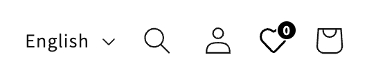
A typical header setup — black icon matching the cart button, badge overlaid on the icon, text hidden:
{% render 'wl-go-to-btn',
  icon_color: '#e53e3e',
  icon_size: 24,
  icon_size_mobile: 20,
  show_counter: true,
  count_position: 'on_icon',
  count_bg_color: '#000',
  count_text_color: '#ffffff',
  hide_counter_when_empty: true
%}
Troubleshooting
The heart icon doesn't appear
- Confirm that
wl-go-to-btn.liquidexists in the Snippets folder in your theme code. - Check for typos in the render tag — the filename must match exactly.
The badge count doesn't update
- Make sure the Wishlist app is properly initialized on the page. Visit your storefront and check the browser console for any JavaScript errors.
- Confirm
show_counteris not set tofalse.
The wishlist button appears twice or behaves unexpectedly
- You may have both the Header Link Block (App Blocks) and the
wl-go-to-btnsnippet active at the same time. Remove one of them to resolve the conflict.
The link goes to "#" instead of the wishlist page
- The link URL is set automatically by the Wishlist app after it initializes. If it stays as
#, the app may not be loading correctly — check your app settings and ensure the wishlist page has been created.
- Dev: Overview
- Dev: Requirements
- Dev: JavaScript API
- Flow Integration
- How to Use the "Add to Wishlist Button" Snippet
Do you need help?
If you have any questions or run into issues, please contact us — we’re happy to help.