How to Use the "Add to Wishlist Button" Snippet
This guide walks you through adding the Add to Wishlist button to your Shopify theme using the wl-add-button snippet.
Step 1 — Open Your Theme Code Editor
- In your Shopify admin, go to Online Store → Themes.
- Find your active theme and click ⋯ (Actions) → Edit code.
Step 2 — Add the Snippet File
In the left sidebar, open the Snippets folder and create wl-add-button.liquid file . This file will contain the button component. Copy snippet code from this article and paste it to the file. Press Save.
Step 3 — Add the Snippet to a Section
Find the section where you want the wishlist button to appear. Common locations:
- Product page —
sections/main-product.liquid - Product card (collection grid) —
snippets/card-product.liquidorsections/main-collection-product-grid.liquid
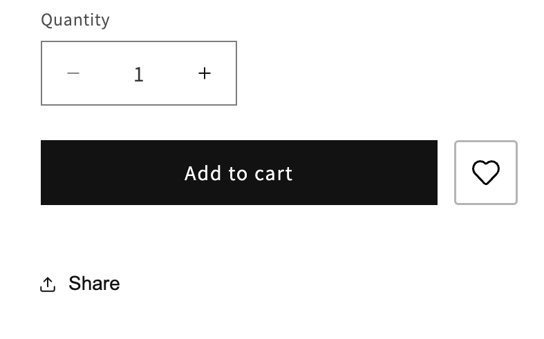
Inside that file, find the right place (typically near the Add to Cart button or product title) and insert a render tag.
Basic example — product page
{% render 'wl-add-button' %}
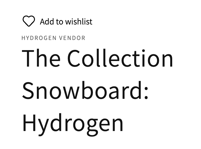
Full example — product card (collection grid)
Important: Make sure that wish_product property is added to snippet. It should be the same product object used in the card.
{% render 'wl-add-button',
   wish_product: card_product,
   show_popup: true,
   button_position: 'absolute',
   view: 'icon_only',
   content_align: 'left',
   popup_position: 'bottom-left',
   margin_top: '8',
   margin_bottom: '8',
   margin_left: '8',
   margin_right: '8'
%}
Tip: When using
button_position: 'absolute', make sure the parent container hasposition: relativeset in its CSS so the button overlays the card correctly.
Step 4 — Available Properties
All properties are optional. If you omit one, its default value is used automatically.
Product
| Property | Default | Description |
|---|---|---|
wish_product |
current product |
The product object to use. Pass card_product or any other object used on collection grids. |
Button Layout
| Property | Default | Options | Description |
|---|---|---|---|
button_position |
'static' |
'static', 'absolute' |
How the button is positioned. Use 'absolute' to overlay on a card image. |
view |
'icon_and_text' |
'icon_and_text', 'icon_only', 'text_only' |
What the button displays. |
content_align |
'left' |
'left', 'center' , 'right' |
Horizontal alignment of the button content. |
max_width |
0 |
any number (px) | Maximum width of the button. 0 means no limit. |
Margins (in pixels)
| Property | Default | Description |
|---|---|---|
margin_top |
0 |
Top margin |
margin_bottom |
0 |
Bottom margin |
margin_left |
0 |
Left margin |
margin_right |
0 |
Right margin |
Icon
| Property | Default | Description |
|---|---|---|
icon_color |
'#000000' |
Icon color (any CSS color value) |
icon_size |
20 |
Icon size on desktop (px) |
icon_size_mobile |
20 |
Icon size on mobile (px) |
Text
| Property | Default | Description |
|---|---|---|
text_color |
'#000000' |
Button text color |
text_size |
14 |
Text size on desktop (px) |
text_size_mobile |
14 |
Text size on mobile (px) |
icon_text_gap |
6 |
Gap between icon and text (px) |
Popup (Confirmation Banner)
| Property | Default | Description |
|---|---|---|
show_popup |
true |
Show a confirmation popup after adding to wishlist |
popup_position |
'bottom-left' |
Where the popup appears on screen. Options: 'bottom-left' , 'bottom-right' , 'top-left' , 'top-right' |
slide_right |
false |
Popup slides in from the right instead of the left |
popup_bg_color |
'#ffffff' |
Popup background color |
popup_text_color |
'#000000' |
Popup text color |
popup_font_size |
16 |
Popup text size on desktop (px) |
popup_font_size_mobile |
14 |
Popup text size on mobile (px) |
popup_padding_x |
20 |
Horizontal padding inside the popup (px) |
popup_padding_y |
20 |
Vertical padding inside the popup (px) |
popup_border_radius |
4 |
Popup corner radius (px) |
Popup Close Button
| Property | Default | Description |
|---|---|---|
popup_close_btn_color |
'#1b1b1b' |
Color of the × close icon |
popup_close_btn_size |
14 |
Close icon size on desktop (px) |
popup_close_btn_size_mobile |
12 |
Close icon size on mobile (px) |
Popup Action Button (View Wishlist link)
| Property | Default | Description |
|---|---|---|
popup_btn_bg_color |
'#000000' |
Button background color |
popup_btn_text_color |
'#ffffff' |
Button text color |
popup_btn_font_size |
14 |
Button text size on desktop (px) |
popup_btn_font_size_mobile |
13 |
Button text size on mobile (px) |
popup_btn_border_radius |
4 |
Button corner radius (px) |
popup_btn_padding_x |
16 |
Horizontal padding inside the button (px) |
popup_btn_padding_y |
10 |
Vertical padding inside the button (px) |
Step 5 — Add Translations
The snippet uses Shopify's translation system. You need to add the translation strings to your theme's locale files.
Where to find locale files
In the code editor, open the Locales folder. You will see files like en.default.json , fr.json, etc.
What to add
Open your default locale file (usually en.default.json) and find or create a "wishlist" section. Add the following keys inside it:
"wishlist": {
  "add_to_wishlist_btn": {
    "text_add": "Add to wishlist",
    "text_remove": "Added to wishlist",
    "info_text": "{product} has been added to your wishlist successfully.",
    "link_text": "View wishlist",
    "modal_aria_label": "Added to wishlist",
    "modal_close": "Close"
  }
}
Important: If a
"wishlist"key already exists in the file, add only the"add_to_wishlist_btn"block inside it — do not create a duplicate"wishlist"key.
Translation key reference
| Key | Purpose |
|---|---|
text_add |
Label shown on the button before the item is added |
text_remove |
Label shown on the button after the item is added |
info_text |
Message shown in the popup. Use {product} and {variant} as placeholders — they are replaced with the actual product and variant name automatically. |
link_text |
Text of the "View wishlist" button inside the popup |
modal_aria_label |
Screen reader label for the popup (accessibility) |
modal_close |
Screen reader label for the close button (accessibility) |
Adding translations for other languages
Repeat the same process for each language file in the Locales folder (e.g. fr.json, de.json), translating the values into the appropriate language while keeping the keys identical.
Common Use Cases
Product page — icon only, static position
 {% render 'wl-add-button',
    view: 'icon_only',
    max_width: 46,
    button_border: true,
    button_padding_x: 8,
    button_padding_y: 10,
    content_align: 'center',
    button_border_color: '#b5b5b5ff',
    button_border_width: 1.5,
    button_border_radius: 3
  %}
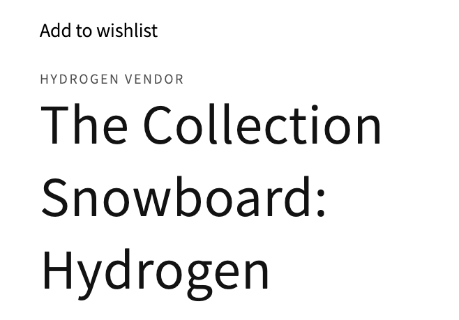
Product page — icon and text, static position
{% render 'wl-add-button',
   view: 'icon_and_text',
   content_align: 'left',
   button_position: 'static',
   icon_color: '#000',
   text_color: '#000',
   text_size: 14
 %}
Collection card — icon only, overlaid on image
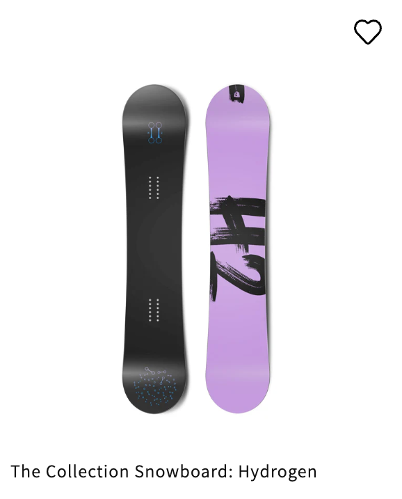
{% render 'wl-add-button',
   wish_product: card_product,
   view: 'icon_only',
   button_position: 'absolute',
   icon_color: '#ffffff',
   icon_size: 22,
   margin_top: 12,
   margin_left: 12,
   show_popup: true,
   popup_position: 'bottom-right'
%}
Important: Make sure that wish_product property is added to snippet. It should be the same product object used in the card.
Minimal — no popup, text only
{% render 'wl-add-button',
  view: 'text_only',
  content_align: 'left',
  button_position: 'static',
  icon_color: '#000',
  text_color: '#000',
  text_size: 14
%}
Troubleshooting
The button does not appear
- Make sure the snippet file
wl-add-button.liquidexists in the Snippets folder.
The button is not working on the product/collection card
- Make sure that wish_product property is added to snippet. It should be the same product object used in the card.
Popup text shows raw keys like wishlist.add_to_wishlist_btn.text_add
- The translation keys are missing. Follow Step 5 to add them to your locale files.
Button overlaps other elements on product cards
- When using
button_position: 'absolute', the parent element needsposition: relativein its CSS. Edit the card template's styles or add an inline style to the wrapper element.
Variant does not update when switching options
- The snippet auto-detects variant changes from the product form. If your theme uses a non-standard variant selector, contact support.
- Dev: Overview
- Dev: Requirements
- Dev: JavaScript API
- Flow Integration
- How to Use the "Go to Wishlist Button" Snippet
Do you need help?
If you have any questions or run into issues, please contact us — we’re happy to help.