Adding and Customizing the Wishlist Button on the Product Page
Add the wishlist button block to your product page so customers can save items to their wishlist directly from the product page. If your theme doesn't support app blocks, use the floating button embed instead.
Adding the Wishlist Button (as App Block)
- Go to your Shopify theme editor.
- Open the Product page template.
-
In the Product information section, click Add block and select Add to Wishlist Button from the app blocks list.
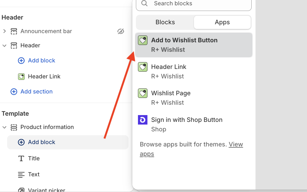
- Click Save.

Adding the Floating Wishlist Button (for themes without app block support)
If your theme doesn't support app blocks, you can add the wishlist button as a floating button that appears across your store.
- Go to your Shopify theme editor.
- Navigate to App embeds (the puzzle piece icon in the left sidebar).
-
Find Floating Wishlist Button and toggle it on.
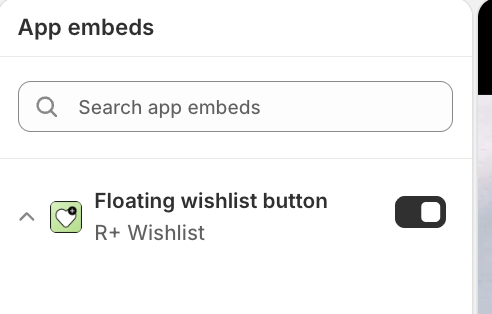
- Click Save.

Customizing the Wishlist Button (App Block)
Once the block is added, you can configure it using the settings panel on the left. The settings are grouped into several sections.
Block visibility
These settings control who can see the wishlist button on the live storefront. In the theme editor, the block stays visible for preview.
| Setting | Description |
|---|---|
| Show to | Who can see this block on the live storefront. Options: Guests and customers — visible to all visitors; Logged in customers only — hidden for guests. Default: Guests and customers. |
Button Text
These settings let you control the labels shown on the button depending on the wishlist state.
| Setting | Description |
|---|---|
| Display style | How the button content is displayed. Options: Icon and label — icon and text; Icon only — icon only; Label only — text only. Default: Icon and label. |
| Gap between icon and text | Space between the icon and the label. Range: 0–32px. Default: 6px. Visible when Display style is Icon and label. |
| Alignment | Horizontal alignment of the button content. Options: Left; Center; Right. Default: Left. |
| Top spacing | Space above the button. Range: 0–80px. Default: 0px. |
| Bottom spacing | Space below the button. Range: 0–80px. Default: 0px. |
| Left spacing | Space to the left of the button. Range: 0–80px. Default: 0px. |
| Right spacing | Space to the right of the button. Range: 0–80px. Default: 0px. |
| Maximum width | Maximum width of the button. Range: 0–600px (step: 10). Default: 0. Set to 0 for no limit and let the button size naturally. |
Text
These settings control the labels shown on the button depending on the wishlist state. Available when Display style includes text (Icon and label or Label only).
| Setting | Description |
|---|---|
| Add label | Text shown when the product is not yet in the wishlist. Default: Add to Wishlist . Hidden when Display style is Icon only. |
| Remove label | Text shown when the product is already in the wishlist. Default: Remove from Wishlist . Hidden when Display style is Icon only. |
| Font size (Desktop) | Label text size on desktop. Range: 8–48px. Default: 14px. Hidden when Display style is Icon only. |
| Font size (Mobile) |
Label text size on mobile. Range: 8–36px. Default: 14px. Hidden when Display style is Icon only.
|
| Text colour | Colour of the button label. Default: #000000 . Hidden when Display style is Icon only. |
Icon
These settings control the icon displayed on the button. Available when Display style includes an icon (Icon and label or Icon only).
| Setting | Description |
|---|---|
| Icon | Icon shown on the button. Options: Heart; Star; Bookmark; Custom. Default: Heart. Hidden when Display style is Label only. |
| Custom icon (Default state icon) | Upload an image to use as the icon when the product is not yet wishlisted. Recommended: 48x48 px (square, PNG/SVG). Visible when Icon is Custom and Display style is not Label only. |
| Custom icon (Active state icon) | Upload an image to use as the icon when the product is already wishlisted. Recommended: 48x48 px (square, PNG/SVG). Visible when Icon is Custom and Display style is not Label only. |
| Icon size (Desktop) | Icon size on desktop. Range: 8–64px. Default: 20px. Hidden when Display style is Label only. |
| Icon size (Mobile) | Icon size on mobile. Range: 8–40px. Default: 20px. Hidden when Display style is Label only. |
| Icon colour | Colour of the built-in icon. Default: #000000 . Not applied to custom images. Hidden when Display style is Label only. |
Customizing the Floating Wishlist Button
Once enabled, click the Floating Wishlist Button embed to open its settings panel. The Floating Wishlist Button embed comes with a rich set of customization options, organized into four sections: Block visibility, Layout, Button, and Icon.
Block visibility
These settings control who can see the floating wishlist button on the live storefront. In the theme editor, the embed stays visible for preview.
| Setting | Description |
|---|---|
| Show to | Who can see this embed on the live storefront. Options: Guests and customers — visible to all visitors; Logged in customers only — hidden for guests. Default: Guests and customers. |
Layout
These settings control where the floating button appears on the screen.
| Setting | Description |
|---|---|
| Button position | Corner of the screen where the floating button appears. Options: Bottom left; Bottom right; Top left; Top right. Default: Bottom right. |
| Offset (vertical edge) | Distance from the button to the nearest vertical edge of the screen. Range: 0–100px. Default: 24px. |
| Offset (horizontal edge) |
Distance from the button to the nearest horizontal edge of the screen. Range: 0–100px. Default: 24px.
|
Button
These settings control the size, colour, and shape of the floating action button.
| Setting | Description |
|---|---|
| Button size (Desktop) | Size of the floating button on desktop. Range: 36–96px. Default: 56px. |
| Button size (Mobile) | Size of the floating button on mobile. Range: 36–88px. Default: 52px. |
| Button vertical padding | Space above and below the button content. Range: 0–40px. Default: 10px. |
| Button horizontal padding |
Space to the left and right of the button content. Range: 0–40px. Default: 10px.
|
| Button background | Background colour of the floating button. Default: #111111 . |
| Button border width |
Thickness of the floating button border. Range: 0–10px. Default: 0px.
|
| Button corner radius | Corner rounding of the floating button. Range: 0–100px. Default: 100px. |
| Button border colour |
Colour of the floating button border. Default:
#111111 . Visible when Button border width is greater than 0.
|
| Button shadow | Shows a drop shadow on the floating button. Options: On — shadow is shown; Off — shadow is hidden. Default: On. |
| Button shadow colour | Colour of the drop shadow. Default: #000000 . Visible when Button shadow is On. |
Icon
These settings control the icon displayed inside the floating button.
| Setting | Description |
|---|---|
| Icon | Icon shown on the floating button. Options: Heart; Star; Bookmark; Custom. Default: Heart. |
| Custom icon (Default state icon) | Upload an image to use as the icon when the product is not yet wishlisted. Recommended: 48x48 px (square, PNG/SVG). Visible when Icon is Custom. |
| Custom icon (Active state icon) | Upload an image to use as the icon when the product is already wishlisted. Recommended: 48x48 px (square, PNG/SVG). Visible when Icon is Custom. |
| Icon size (Desktop) | Icon size on desktop. Range: 12–64px. Default: 22px. |
| Icon size (Mobile) | Icon size on mobile. Range: 10–52px. Default: 20px. |
| Icon colour | Colour of the built-in icon. Default: #ffffff . Not applied to custom images. |
Having trouble adding our app blocks to your store? The R+ Wishlist development team is happy to help you get everything set up quickly and smoothly. Check this article.
Do you need help?
If you have any questions or run into issues, please contact us — we’re happy to help.