Customer Accounts (New) — Wishlist Block Setup Guide
If your Shopify store uses the new Customer Accounts experience, blocks are added through a dedicated editor rather than the standard Theme Editor. Follow this guide to add and configure the wishlist block in your customer account pages.
If you're using the legacy customer accounts, please refer to this guide instead.
Adding the Wishlist Block
-
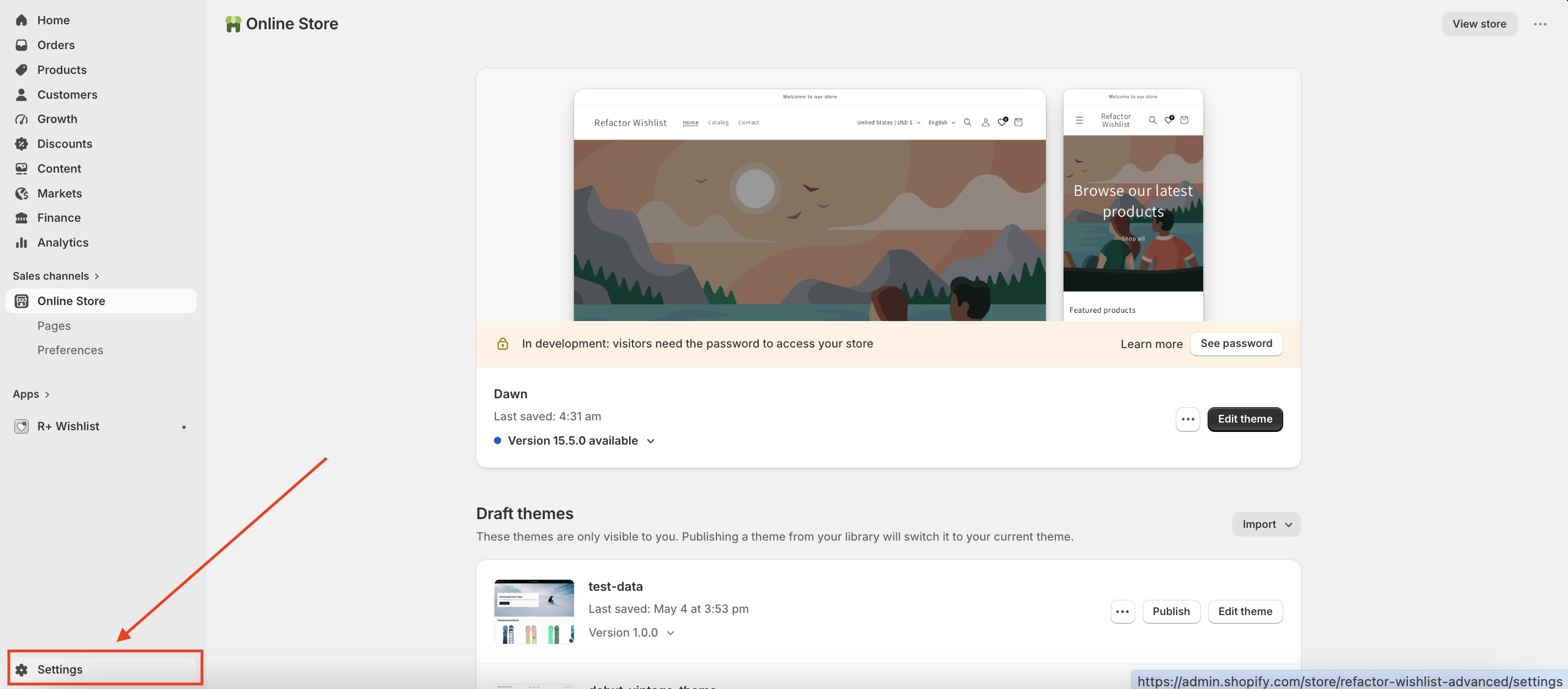
Go to your store's Admin panel and open Settings.
-
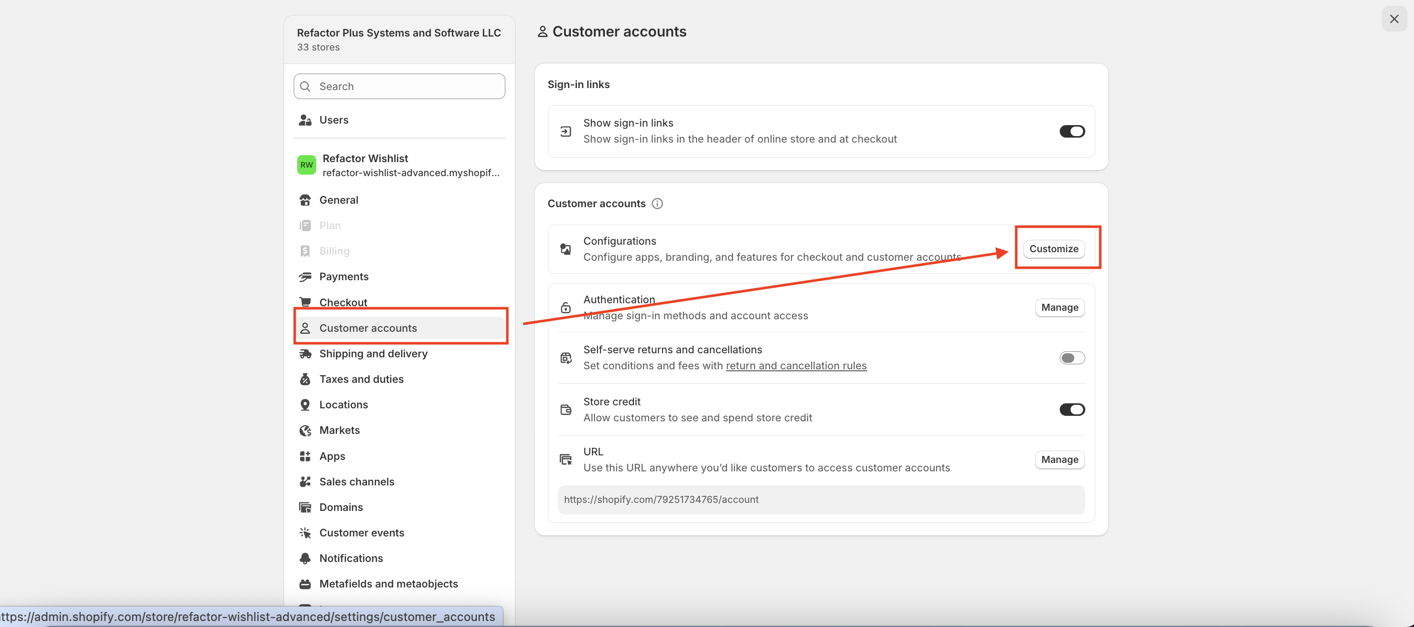
Navigate to Customer Accounts → Configurations → Customize.
-
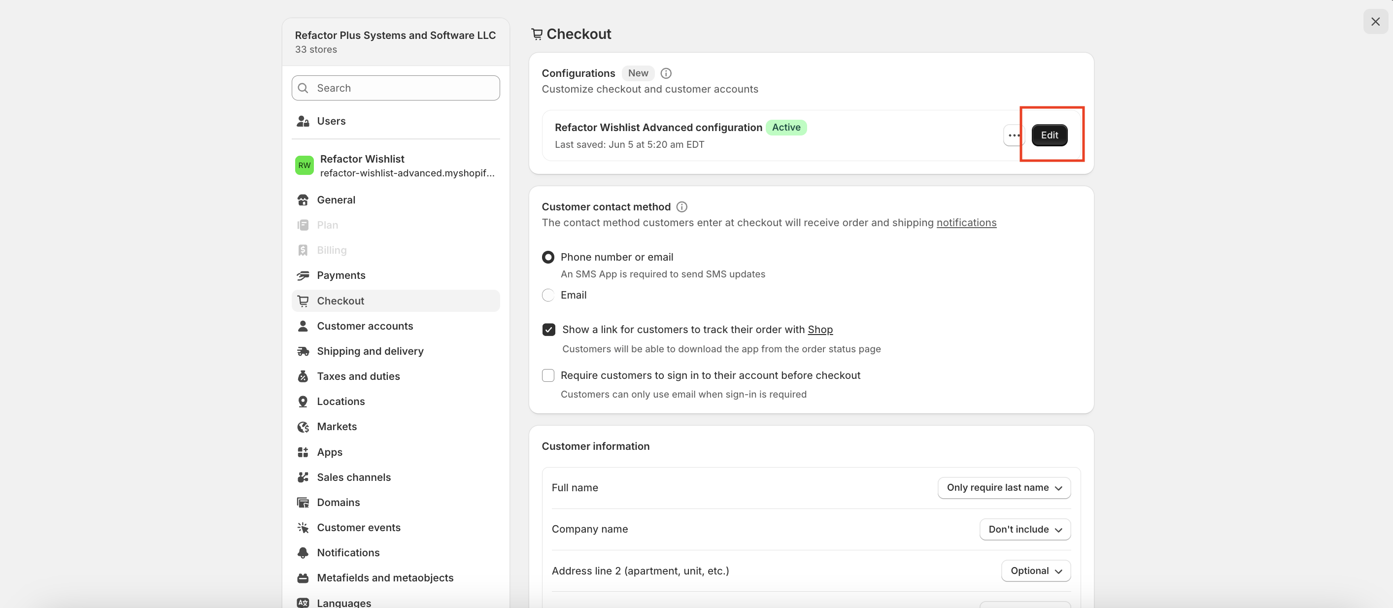
Select the Configuration you want to customize and click Customize again.
-
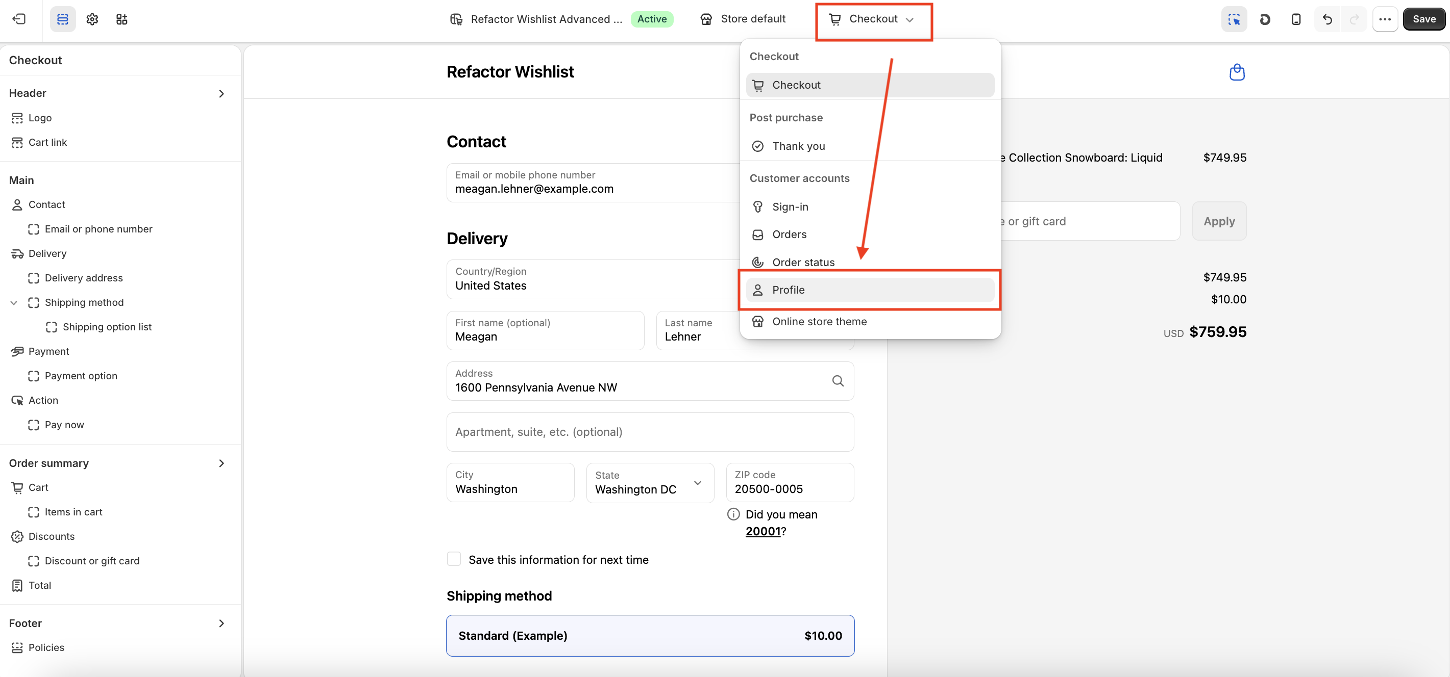
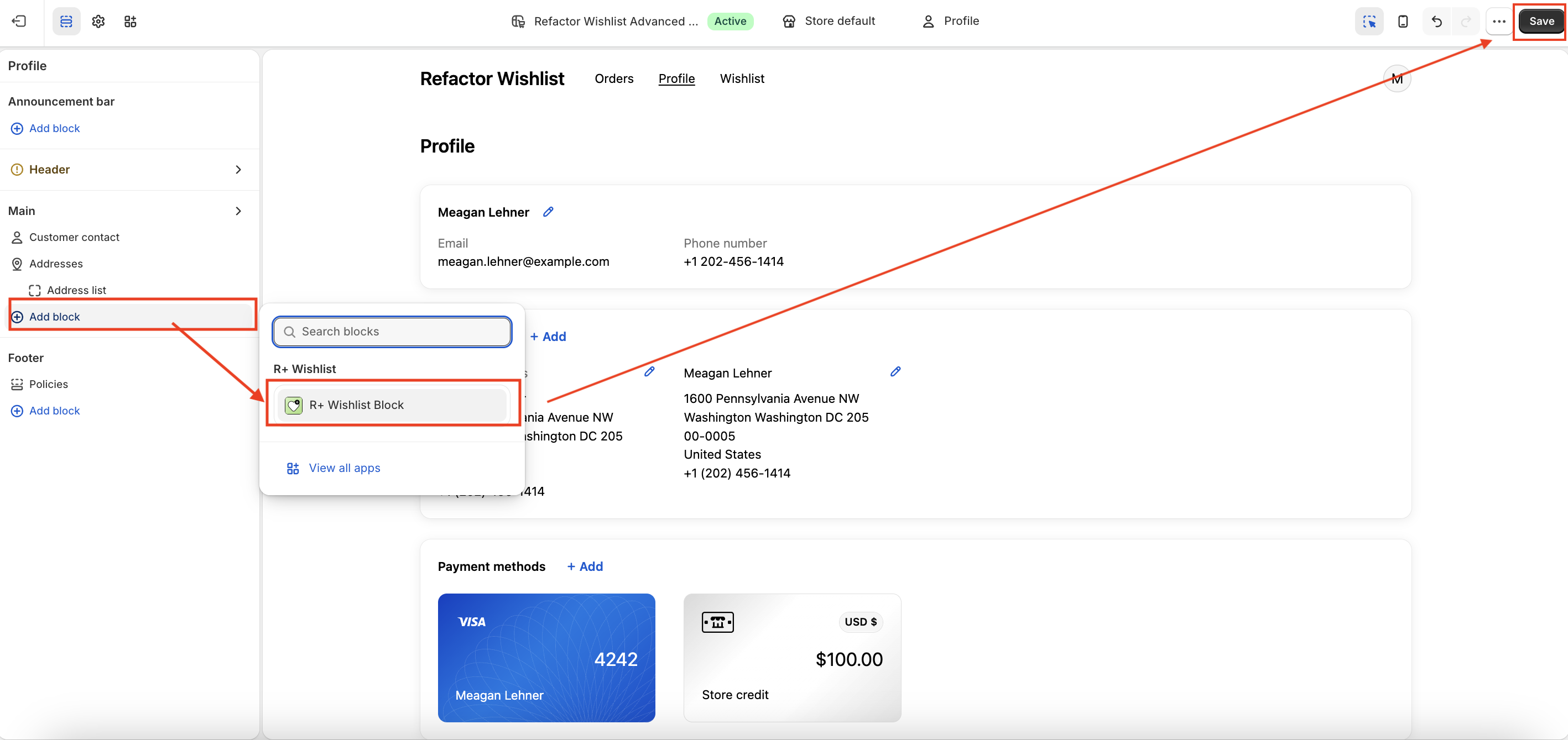
Then the customizer opens, and in the dropdown at the top, choose Customer Accounts → Profile.
- Click Add Block and select R+ Wishlist Block.
-
Click Save.


Adding the Wishlist Page
-
Go to your store's Admin panel and open Settings.
-
Navigate to Customer Accounts → Configurations → Customize.
-
Select the Configuration you want to customize and click Customize again.
-
Then the customizer opens, and in the dropdown at the top, choose Customer Accounts → Profile.
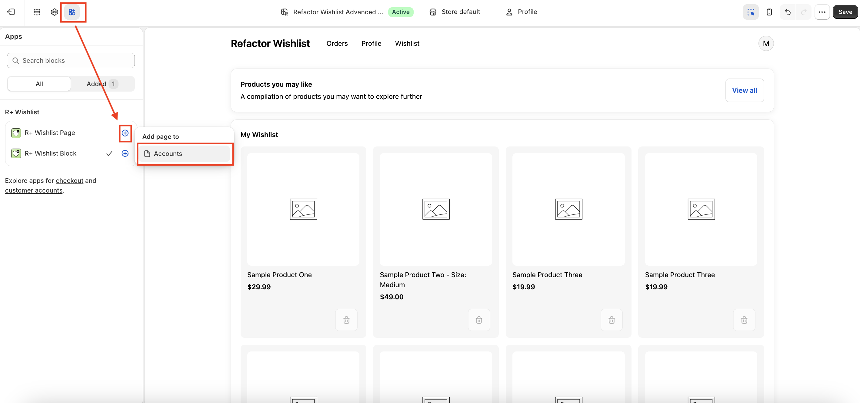
- Navigate to Apps tab (the puzzle piece icon in the left sidebar).
- Find R+ Wishlist Page Block and click on the (+) icon.
- Choose Add page to → Accounts.
-
Click Save.
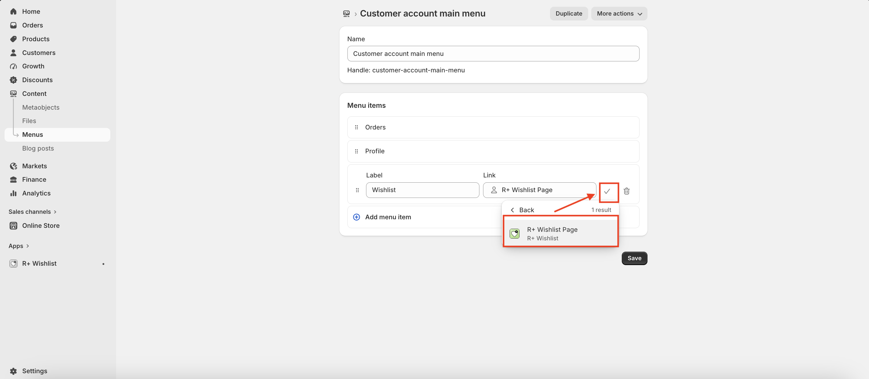
- Go to Online Store → Content → Menus and click on Customer account main menu.
-
Click Add menu item.
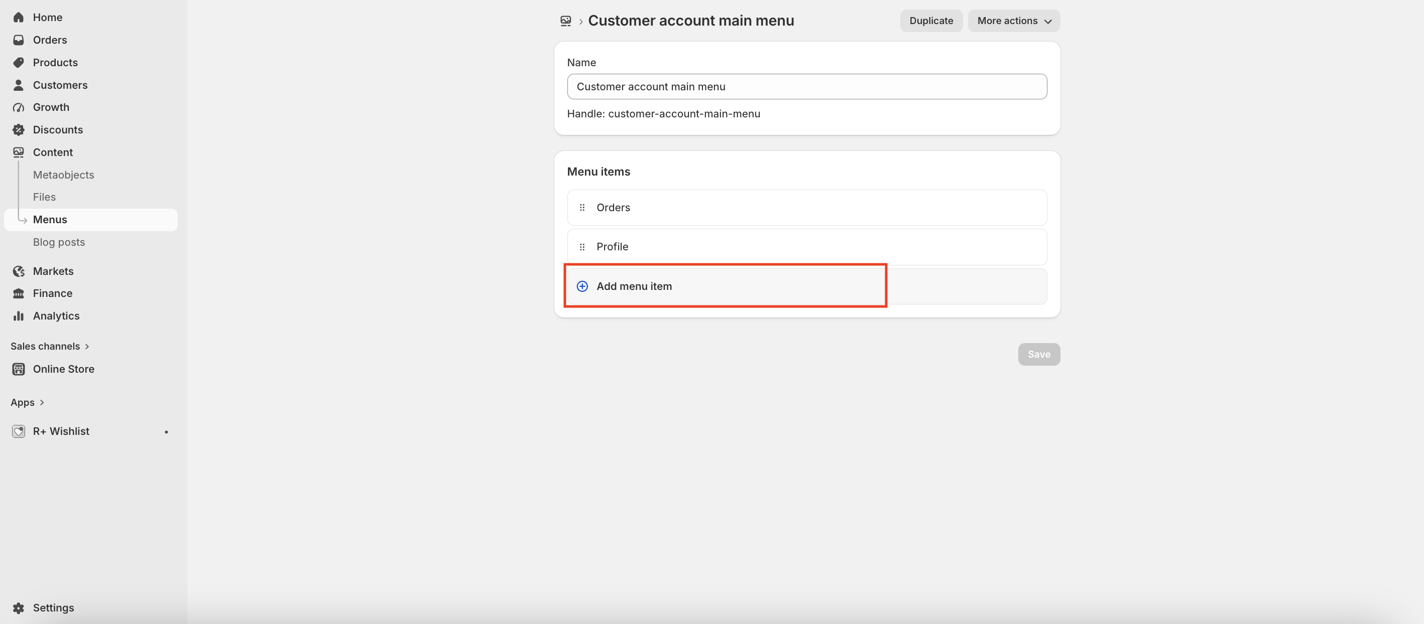
- Enter the page name (for example, Wishlist).
-
Click on the Link field and choose Customer accounts → Apps.
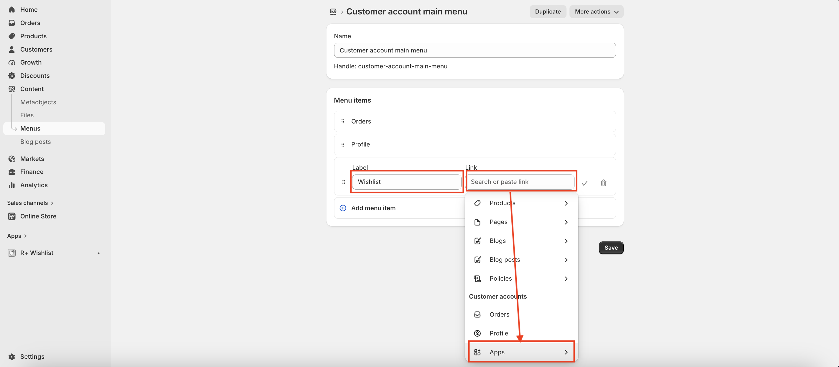
-
Choose R+ Wishlist Page, then press V button. Press Save.


Customizing the Wishlist Block
Once the block has been added, you can configure its appearance and behavior directly in the editor. The settings are organized into three sections below.
Section Header
These settings control the header displayed above the wishlist.
| Setting | Description |
|---|---|
| Show section header | Shows the header area above the wishlist. Options: On — header is shown; Off — header is hidden. Default: Off. |
| Header content | What is shown in the header. Options: Both; Title Only; Subtitle Only; None. Default: Both. |
| Header title | Main heading in the header. Example: Your wishlist . |
| Header subtitle | Secondary text below the title. Example: Products you have saved for later . |
| View all link destination | Where the View all action goes. Use a relative path (e.g. /pages/wishlist ) or a full URL. |
Product Grid
These settings control how wishlist products are displayed in the block.
| Setting | Description |
|---|---|
| Product card style | Look and image position of each product card. Options: Standard Vertical; Standard Horizontal; Bordered Vertical; Bordered Horizontal; Minimal Vertical; Minimal Horizontal. Default: Standard Vertical. |
| Product columns (desktop) | Product cards per row on desktop. Options: 2 grid; 3 grid; 4 grid. Default: 4 grid. |
| Product columns (mobile) | Product cards per row on mobile. Options: 1 grid; 2 grid. Default: 1 grid. |
| Content alignment | Horizontal alignment of card content. Options: Left; Centre; Right. Default: Left. |
| Show stock status | Shows an In stock / Out of stock label on each product card. Options: On — label is shown; Off — label is hidden. Default: Off. |
| Show view product link | Shows a link on each card to the product page on your store. Options: On — link is shown; Off — link is hidden. Default: Off. |
| View product style | Style of the product page link. Options: Link; Link with arrow; Button; Button with arrow. Default: Link with arrow. |
Text & Labels
These settings let you customize the text displayed within the wishlist block.
| Setting | Description |
|---|---|
| Empty state message | Message shown when the customer's wishlist has no products. Example: No items in your wishlist yet. Add products while browsing. |
Share Wishlist
These settings control sharing a wishlist from Customer Account.
| Setting | Description |
|---|---|
| Show share button | Lets customers copy a share link from Customer Account. Options: On — share button is shown; Off — share button is hidden. Default: Off. |
| Share button label | Text on the share button. Example: Share . |
| Copied label |
Text shown after the link is copied. Example:
Copied .
|
| Shared wishlist opens on | Where the shared link opens for recipients. Options: App page (built-in) (default ); Custom page (custom_page ). Default: App page (built-in). |
| Custom page link | Relative path (e.g. /pages/wishlist ) or full URL. Used when Shared wishlist opens on is Custom page. |
Do you need help?
If you have any questions or run into issues, please contact us — we’re happy to help.