
Adding and Customizing the Subscribed Products Page
Overview
Add the Subscribed Products page to your theme so customers can view and manage all their back-in-stock alerts in one place. If your theme doesn't support app blocks, use the floating button embed instead.
To use the Subscribed Products page functionality you need to add the block to a page template and optionally configure its appearance.
Adding the Subscribed Products Page (as App Block)
Add the Subscribed Products block to a page template
Step 1: Create a page template
-
Go to Online Store → Themes and click Edit theme on your active theme.
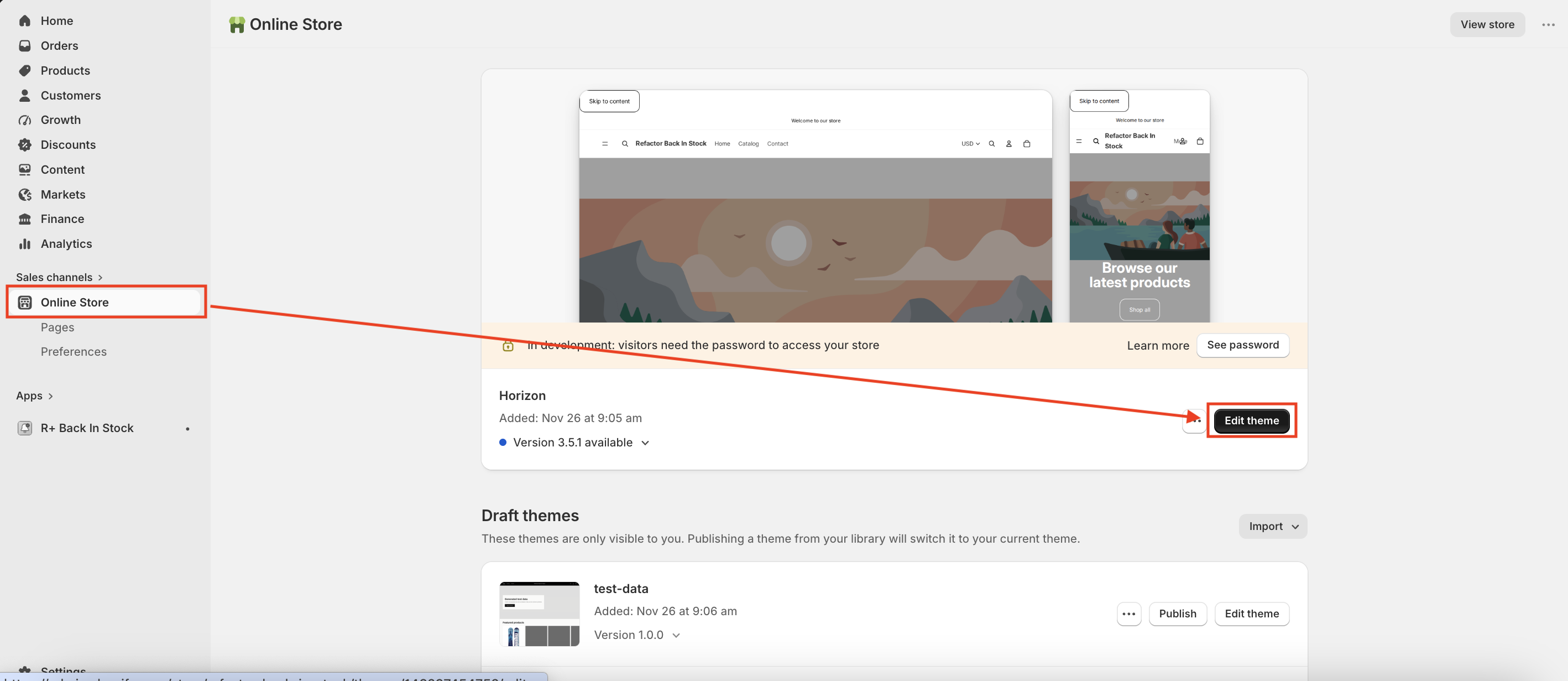
- Open the page where you want to display the customer’s subscribed products, for example product page
-
In the template editor, click Add section in the left sidebar and select Subscribed Products Block from the list
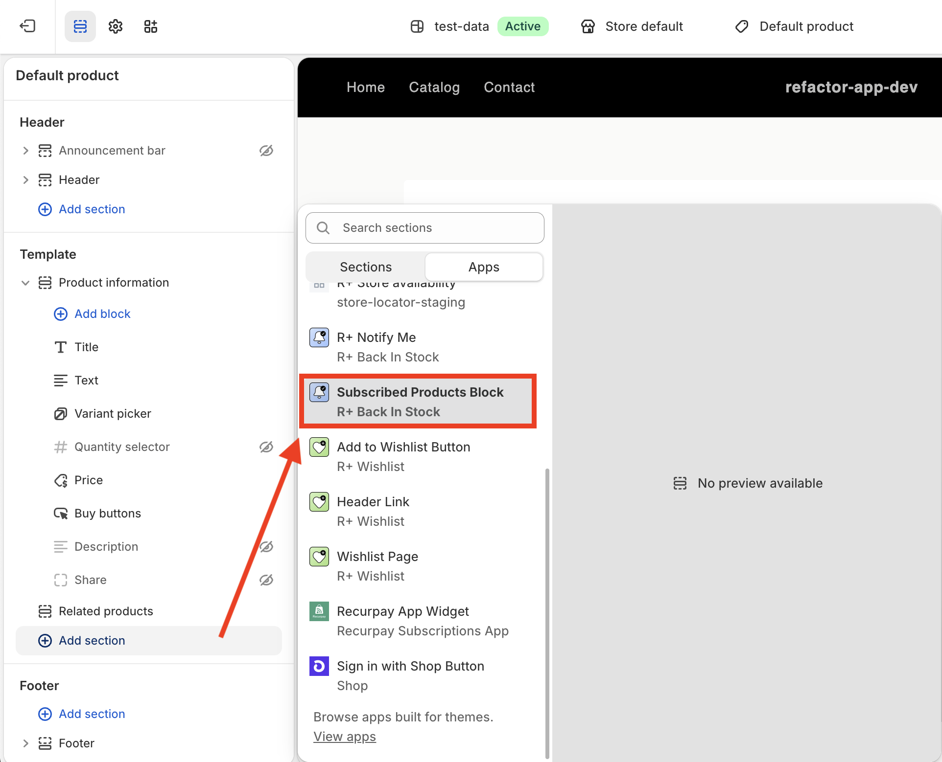
- Click Save.
Adding the Floating Products Button (for themes without app block support)
If your theme doesn't support app blocks, you can add a floating button that lets customers reach their subscribed products from anywhere in your store. Enabling it also automatically generates a Subscribed Products page for the button to link to.
-
Go to your Shopify theme editor.
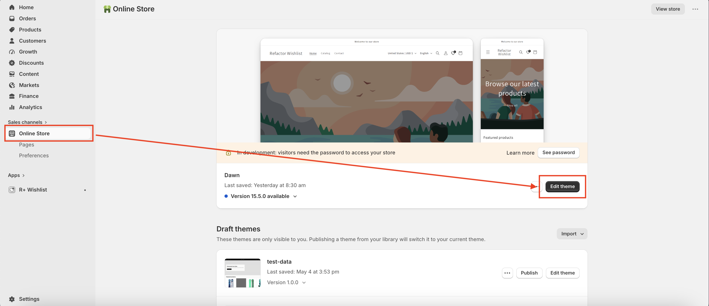
- Navigate to App embeds (the puzzle piece icon in the left sidebar).
-
Find Floating Products Button and toggle it on.
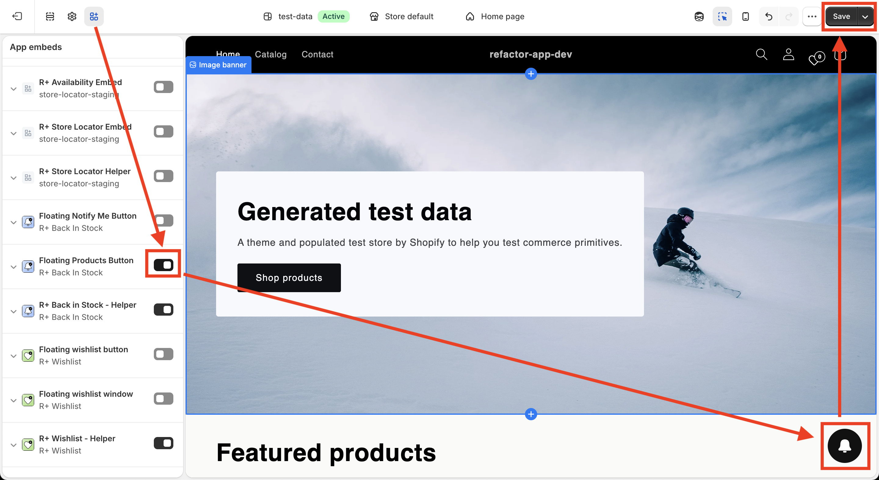
- Click Save.
Customizing the Subscribed Products Page (App Block)
The Subscribed Products block comes with a rich set of customization options, organized into six sections: Layout, Login Banner, Header, Products Layout, Load More Button, and Empty State.
Layout
These settings control the outer spacing around the page block.
| Setting | Description |
|---|---|
| Vertical spacing | Space above and below the block. Range: 0–80px. Default: 0px. |
| Horizontal spacing | Space to the left and right of the block. Range: 0–80px. Default: 0px. |
Login Banner
These settings control the banner shown to guests who are not logged in. The banner encourages visitors to sign in so their alerts are tied to their account.
| Setting | Description |
|---|---|
| Show message to guests | Shows a login banner when the customer is not logged in. Default: On. |
| Guest message | Text shown inside the banner asking guests to log in. Default: Please log in to view your subscribed restock notifications. |
| Message font size (Desktop) | Banner text size on desktop. Range: 8–32px. Default: 15px. Visible when Show message to guests is On. |
| Message font size (Mobile) | Banner text size on mobile. Range: 8–24px. Default: 14px. Visible when Show message to guests is On. |
| Border width | Thickness of the banner border. Range: 0–10px. Default: 0px. Visible when Show message to guests is On. |
| Background color | Background colour of the banner. Default: #f2f2f2 . Visible when Show message to guests is On. |
| Text color | Colour of the banner text. Default: #000000 . Visible when Show message to guests is On. |
| Border color | Colour of the banner border. Default: #000000 . Visible when Show message to guests is On. |
| Button text | Text on the login button inside the banner. Default: Log in . |
| Button font size (Desktop) | Login button text size on desktop. Range: 8–24px. Default: 14px. Visible when Show message to guests is On. |
| Button font size (Mobile) | Login button text size on mobile. Range: 8–18px. Default: 13px. Visible when Show message to guests is On. |
| Button icon size (Desktop) | Login button icon size on desktop. Range: 12–48px. Default: 16px. Visible when Show message to guests is On. |
| Button icon size (Mobile) | Login button icon size on mobile. Range: 12–32px. Default: 14px. Visible when Show message to guests is On. |
| Button border width | Thickness of the login button border. Range: 0–10px. Default: 0px. Visible when Show message to guests is On. |
| Button background color | Background colour (or gradient) of the login button. Default: #000000 . Visible when Show message to guests is On. |
| Button text color | Text colour of the login button. Default: #ffffff . Visible when Show message to guests is On. |
| Button border color | Colour of the login button border. Default: #000000 . Visible when Show message to guests is On. |
Header
These settings control the title at the top of the page and the clear-all action.
| Setting | Description |
|---|---|
| Title | Heading at the top of the page. Default: Restock Notifications . |
| Title font size (Desktop) | Title size on desktop. Range: 8–60px. Default: 42px. |
| Title font size (Mobile) | Title size on mobile. Range: 8–32px. Default: 28px. |
| Title color | Colour of the page title. Default: #000000 . |
| Clear button text | Text on the button that removes all alerts at once. Default: Clear all . |
| Clear font size (Desktop) | Size of the clear-all button on desktop. Range: 8–32px. Default: 16px. |
| Clear font size (Mobile) | Size of the clear-all button on mobile. Range: 8–20px. Default: 14px. |
| Clear button color | Text colour of the clear-all button. Default: #000000 . |
| Show clear icon | Shows an icon next to the clear-all button. Default: On. |
| Clear icon size (Desktop) | Size of the clear-all icon on desktop. Range: 12–48px. Default: 20px. Visible when Show clear icon is On. |
| Clear icon size (Mobile) | Size of the clear-all icon on mobile. Range: 12–24px. Default: 18px. Visible when Show clear icon is On. |
Clear Confirmation Window
When a customer clicks Clear all, a confirmation modal appears. These settings control its text.
| Setting | Description |
|---|---|
| Modal text | Message asking the customer to confirm clearing all alerts. Default: Are you sure you want to remove all back-in-stock alerts? |
| Confirm button text | Text on the button that clears all alerts. Default: Yes, remove . |
| Back button text | Text on the button that closes the modal without clearing. Default: No, back to list . |
Products Layout
These settings control the grid, product cards, badges, and pricing.
| Setting | Description |
|---|---|
| Columns (Desktop) | Number of product columns shown per row on desktop. Range: 2–5. Default: 4. |
| Products per page | Number of products loaded per page before Load More is needed. Range: 4–24 (step 4). Default: 8. |
| Gap between products | Space between product cards. Range: 0–64px. Default: 20px. |
| Product vertical padding | Vertical padding inside each product card. Range: 0–48px. Default: 12px. |
| Product horizontal padding | Horizontal padding inside each product card. Range: 0–48px. Default: 12px. |
| Border width | Thickness of each product card's border. Range: 0–10px. Default: 1px. |
| Border radius | Corner rounding of each product card. Range: 0–32px. Default: 8px. |
| Product background | Background colour of each product card. Default: #ffffff . |
| Border color | Border colour of each product card. Default: #e5e5e5 . |
| Image ratio | Aspect ratio of each product image. Options: Square (1:1) — default; Portrait (3:4); Landscape (4:3); Wide (16:9); Original. |
| Image fit | How the image fills its frame. Options: Contain; Cover (default). |
| Image border radius | Corner rounding of the product image. Range: 0–32px. Default: 4px. |
| Notify badge text | Badge text shown on products the customer is subscribed to. Default: Notify me . |
| Notify badge background | Background colour of the notify badge. Default: #111827 . |
| Notify badge text color | Text colour of the notify badge. Default: #ffffff . |
| Discount badge text | Badge text shown on discounted products. Default: Sale . |
| Discount badge background | Background colour of the discount badge. Default: #dc2626 . |
| Discount badge text color | Text colour of the discount badge. Default: #ffffff . |
| Badge border radius | Corner rounding applied to both badges. Range: 0–24px. Default: 4px. |
| Currency display mode | How currency is shown in prices. Options: Symbol only (default); Currency code only; Symbol and code. |
| Price decimal display | Whether trailing zeros are shown in prices. Options: Show trailing zeros (default); Hide trailing zeros. |
Load More Button
| Setting | Description |
|---|---|
| Button text | Text on the button that loads additional products. Default: Load more . |
| Button background | Background colour (or gradient) of the button. Default: #000000 . |
| Button text color | Text colour of the button. Default: #ffffff . |
| Button border width | Thickness of the button's border. Range: 0–10px. Default: 0px. |
| Button border color | Colour of the button's border. Default: #000000 . |
| Button border radius | Corner rounding of the button. Range: 0–24px. Default: 8px. |
Empty State
| Setting | Description |
|---|---|
| Empty title | Heading shown when the customer has no active alerts. Default: No active alerts . |
| Empty description | Supporting text shown when the customer has no active alerts. Default: You have no active back-in-stock alerts. |
Customizing the Floating Products Button
The Floating Products Button embed comes with a rich set of customization options, organized into two groups: the floating button itself (Layout, Button, Icon), and the Subscribed Products page it links to (Layout & Login Banner, Products & Empty State).
Layout
These settings control where the floating button appears on the screen.
| Setting | Description |
|---|---|
| Position | Corner of the screen where the floating button appears. Options: Bottom left; Bottom right (default); Top left; Top right. |
| Vertical offset | Distance from the button to the nearest vertical edge of the screen. Range: 0–100px. Default: 90px. |
| Horizontal offset | Distance from the button to the nearest horizontal edge of the screen. Range: 0–100px. Default: 24px. |
Button
These settings control the size, colour, and shape of the floating action button.
| Setting | Description |
|---|---|
| Size (desktop) | Size of the floating button on desktop. Range: 36–96px. Default: 56px. |
| Size (mobile) | Size of the floating button on mobile. Range: 36–88px. Default: 52px. |
| Background color | Background colour (or gradient) of the floating button. Default: #111111 . |
| Border width | Thickness of the floating button border. Range: 0–10px. Default: 0px. |
| Border radius | Corner rounding of the floating button. Range: 0–100px. Default: 100px. |
| Border color | Colour of the floating button border. Default: #111111 . Visible when Border width is greater than 0. |
| Show shadow | Shows a drop shadow on the floating button. Default: Off. |
| Shadow color | Colour of the drop shadow. Default: #000000 . Visible when Show shadow is On. |
Icon
These settings control the icon displayed inside the floating button.
| Setting | Description |
|---|---|
| Icon type | Icon shown on the floating button. Options: Bookmark; Bell (default); Custom. |
| Custom icon | Upload an image to use as the floating button's icon. Visible when Icon type is Custom. |
| Icon size | Icon size on desktop. Range: 12–64px. Default: 22px. |
| Icon size (mobile) | Icon size on mobile. Range: 12–48px. Default: 20px. |
| Icon color | Colour of the built-in icon. Default: #ffffff . Not applied to custom images. |
Subscribed Products Page — Layout & Login Banner
These settings control the auto-generated page's login prompt and header text — they're the Page equivalent of the Login Banner and Header settings on the App Block above.
| Setting | Description |
|---|---|
| Guest message | Message shown to visitors who aren't logged in. Default: Please log in to view your subscribed restock notifications. |
| Button text (login) | Text on the guest login button. Default: Log in . |
| Title | Page heading. Default: Restock Notifications . |
| Clear button text | Text on the button that removes all alerts at once. Default: Clear all . |
| Modal text | Confirmation message shown before clearing all alerts. Default: Are you sure you want to remove all back-in-stock alerts? |
| Confirm button text | Text on the confirm button in the clear-all confirmation modal. Default: Yes, remove . |
| Back button text | Text on the cancel button in the clear-all confirmation modal. Default: No, back to list . |
Subscribed Products Page — Products & Empty State
These settings control the product grid on the auto-generated page. They're a reduced set compared to the App Block's Products Layout section above — the auto-generated page uses simpler, fixed spacing and card styling.
| Setting | Description |
|---|---|
| Columns (Desktop) | Number of product columns shown per row on desktop. Range: 2–5. Default: 4. |
| Products per page | Number of products loaded per page before Load More is needed. Range: 4–24 (step 4). Default: 8. |
| Image ratio | Aspect ratio of each product image. Options: Square (1:1) — default; Portrait (3:4); Landscape (4:3); Wide (16:9); Original. |
| Image fit | How the image fills its frame. Options: Contain; Cover (default). |
| Notify badge text | Badge text shown on products the customer is subscribed to. Default: Notify me . |
| Discount badge text | Badge text shown on discounted products. Default: Sale . |
| Currency display mode | How currency is shown in prices. Options: Symbol only (default); Currency code only; Symbol and code. |
| Price decimal display | Whether trailing zeros are shown in prices. Options: Show trailing zeros (default); Hide trailing zeros. |
| Button text (load more) | Text on the button that loads additional products. Default: Load more . |
| Empty title | Heading shown when the customer has no active alerts. Default: No active alerts . |
| Empty description | Supporting text shown when the customer has no active alerts. Default: You have no active back-in-stock alerts. |
| Custom CSS | Write plain CSS to apply extra styling to the auto-generated Subscribed Products page only — no <style> tag needed. |
Having trouble adding our app blocks to your store? The R+ Back In Stock development team is happy to help you get everything set up quickly and smoothly. Check this article.
Do you need help?
If you have any questions or run into issues, please contact us — we’re happy to help.