Favourite Stores — Page & Block Guide
The Favourite Stores block lets customers view and manage the store locations they've saved as favourites. It displays each saved store as a card with address, contact details, opening hours, and a link to Google Maps. Customers can also remove stores from their favourites list directly from this page.
If you have the New Customer Accounts enabled on your store, you can add Favourite Stores to your customer accounts as block or page. Please, check this article.
Adding the Favourite Stores Page to a Page Template
Step 1: Create a page template
-
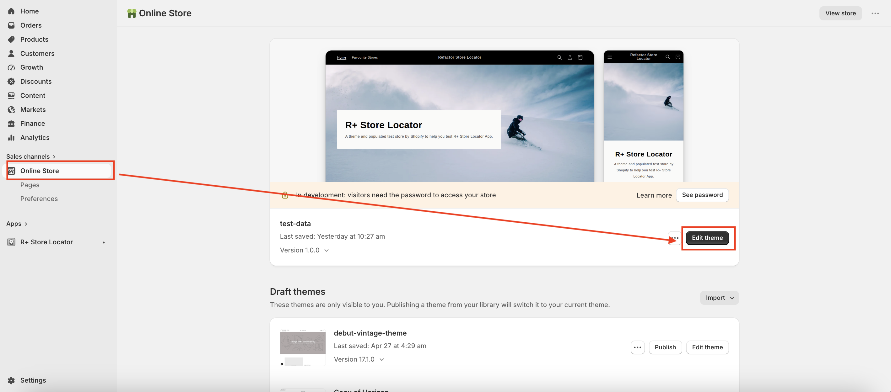
Go to Online Store → Themes, and click Edit theme on your active theme.
-
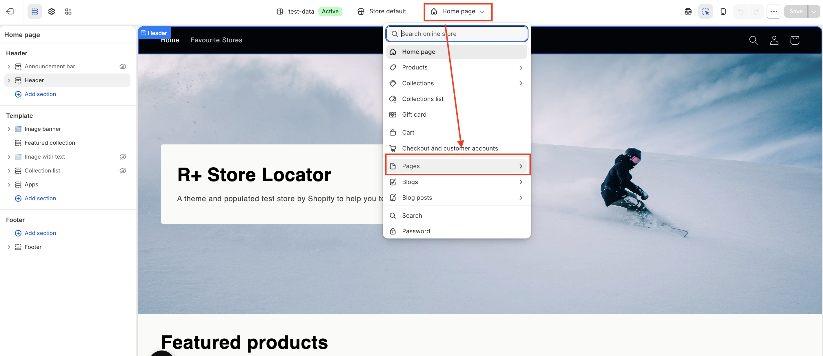
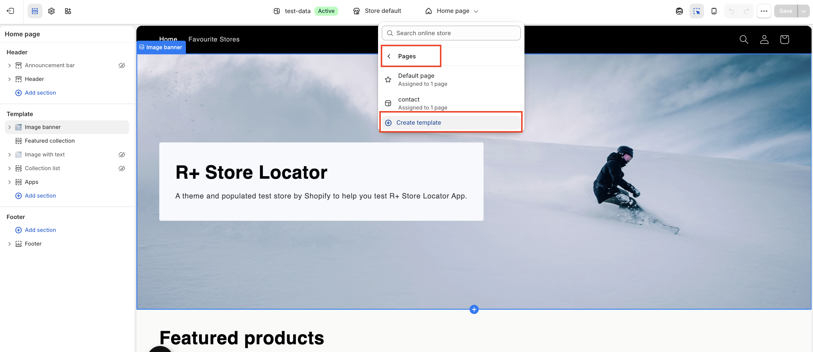
Open the page selector at the top, then go to Pages and click Create template.
-
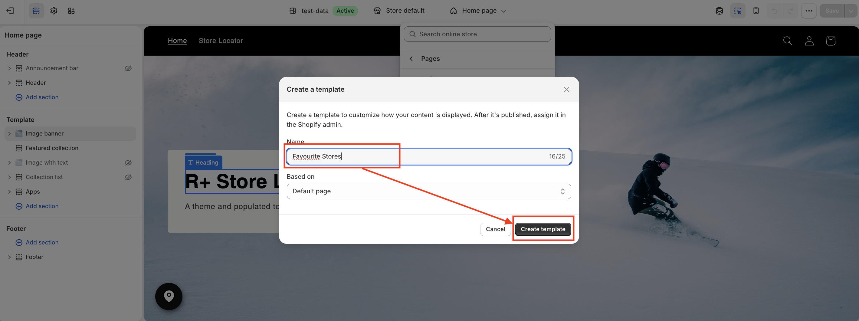
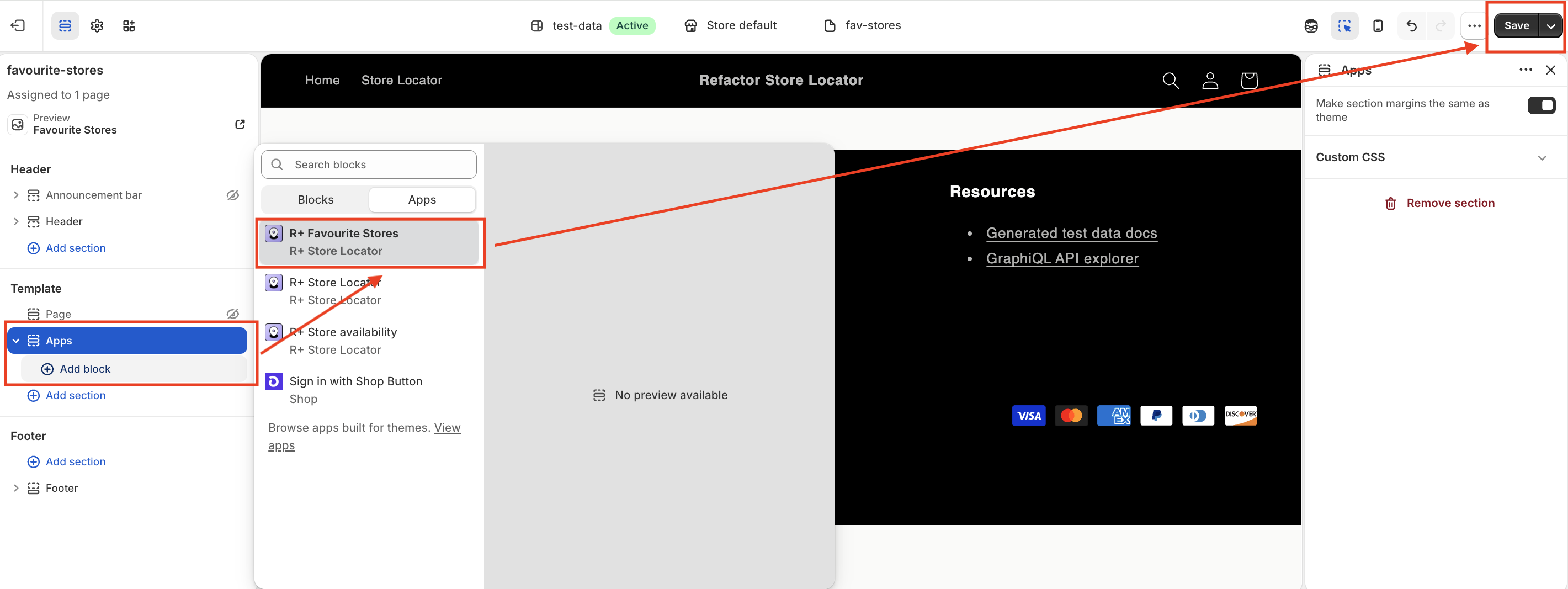
Enter the template name (for example, Favourite Stores) and click Create template.
- Click Add section and select R+ Favourite Stores.
-
Click Save.


Step 2: Create a page using this template
-
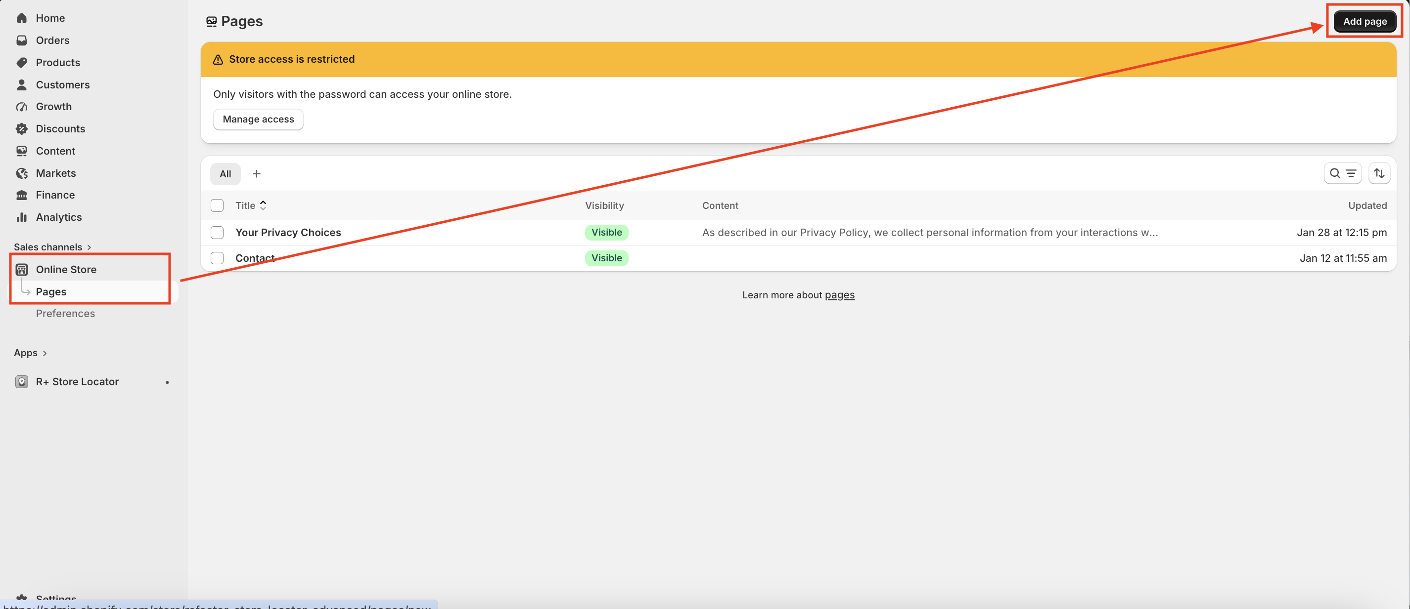
Go to Online Store → Pages and click Add page in the top-right corner.
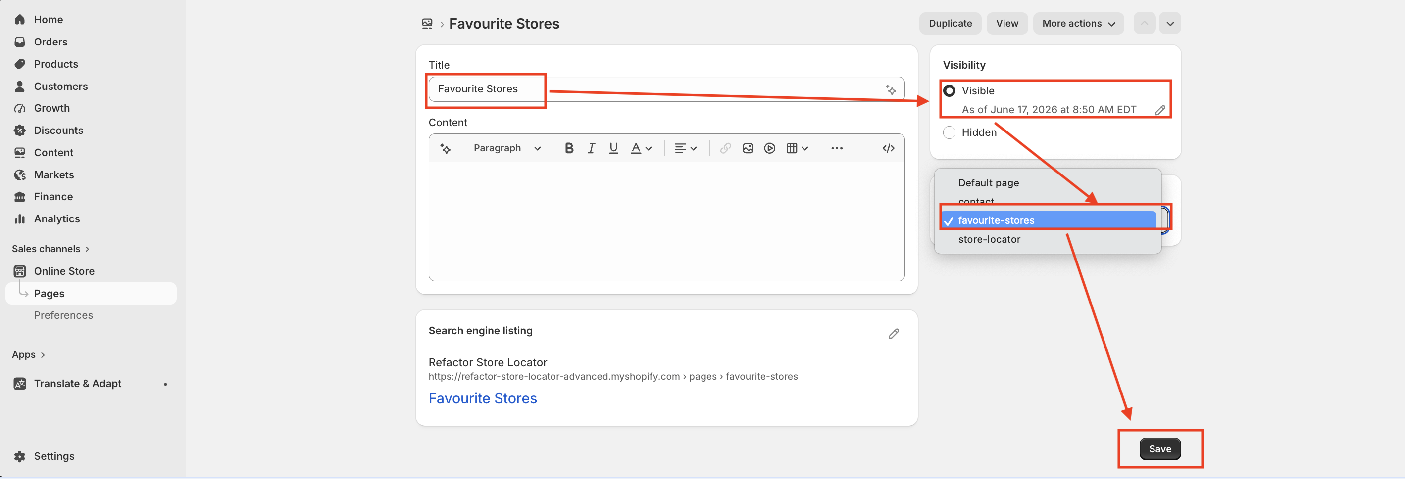
- Enter the page name (for example, Favourite Stores).
- Set the page visibility to Visible.
- Choose the favourite-stores template you created in the previous steps.
-
Click Save.


Theme Editor Settings Reference
The block exposes a wide range of settings in the theme editor, organized into the following groups.
General
| Setting | Description |
|---|---|
| Padding Top (Desktop) | Space above the block on desktop. Range: 0–100px. Default: 0px. |
| Padding Bottom (Desktop) | Space below the block on desktop. Range: 0–100px. Default: 60px. |
| Padding Top (Mobile) | Space above the block on mobile. Range: 0–100px. Default: 0px. |
| Padding Bottom (Mobile) | Space below the block on mobile. Range: 0–100px. Default: 30px. |
| Background Color | Background color of the entire block. Default: #FFFFFF . |
| Enable Max Width | When enabled, constrains the block content to a maximum width. Default: off. |
| Max Width | Maximum width of the content area in pixels (visible only when Enable Max Width is on). Range: 1000–3000px. Default: 1440px. |
| Empty State Text Color | Color of the message shown when the customer has no saved stores. Default: #1d1d1d . |
| Empty State Font Size (Desktop) | Font size of the empty state message on desktop. Range: 10–48px. Default: 18px. |
| Empty State Font Size (Mobile) | Font size of the empty state message on mobile. Range: 10–48px. Default: 16px. |
Title
| Setting | Description |
|---|---|
| Title | Text displayed as the section heading. Default: "Favourite stores". |
| Title (AR) | Alternative title shown when the site language is set to Arabic. Falls back to the main Title if left blank. |
| Color | Color of the section title. Default: #000000 . |
| Font Weight | Weight of the title text. Range: 100–900. Default: 400. |
| Size (Desktop) | Font size of the title on desktop. Range: 12–72px. Default: 32px. |
| Size (Mobile) | Font size of the title on mobile. Range: 12–72px. Default: 28px. |
| Align (Mobile) | Horizontal alignment of the title on mobile: Left, Center, or Right. Default: Center. |
| Align (Desktop) | Horizontal alignment of the title on desktop: Left, Center, or Right. Default: Center. |
Grid
| Setting | Description |
|---|---|
| Columns (Desktop) | Number of store cards per row on desktop: 1, 2, or 3. Default: 3. |
| Columns (Mobile) | Number of store cards per row on mobile: 1 or 2. Default: 1. |
| Gap (Desktop) | Spacing between store cards on desktop. Range: 0–80px. Default: 24px. |
| Gap (Mobile) | Spacing between store cards on mobile. Range: 0–60px. Default: 16px. |
Card
| Setting | Description |
|---|---|
| Card Background | Background color of each store card. Default: #FFFFFF . |
| Padding (Desktop) | Inner padding of each store card on desktop. Range: 0–80px. Default: 24px. |
| Padding (Mobile) | Inner padding of each store card on mobile. Range: 0–60px. Default: 16px. |
| Border Radius | Rounding of the store card corners. Range: 0–40px. Default: 0px. |
| Border Width | Thickness of the store card border. Range: 0–10px. Default: 1px. |
| Border Color | Color of the store card border. Default: #000000 . |
| Box Shadow | CSS box-shadow value applied to the card (e.g., 0 4px 12px rgba(0,0,0,0.1)). Default: none. |
Store Title
| Setting | Description |
|---|---|
| Color | Color of the store name heading inside each card. Default: #000000 . |
| Font Weight | Weight of the store name text. Range: 100–900. Default: 600. |
| Size (Desktop) | Font size of the store name on desktop. Range: 12–48px. Default: 18px. |
| Size (Mobile) | Font size of the store name on mobile. Range: 12–48px. Default: 16px. |
| Margin Bottom | Space between the store name and the content below it. Range: 0–40px. Default: 12px. |
Details Text
| Setting | Description |
|---|---|
| Text Color | Color of the store details text (address, phone, email, etc.). Default: #555555 . |
| Font Size (Desktop) | Font size of the details text on desktop. Range: 10–24px. Default: 14px. |
| Font Size (Mobile) | Font size of the details text on mobile. Range: 10–24px. Default: 13px. |
Links
| Setting | Description |
|---|---|
| Link Color | Color of clickable links such as phone number, email, and website. Default: #000000 . |
| Link Hover Color | Color of links when hovered. Default: #000000 . |
| Underline Links | When enabled, links are displayed with an underline. Default: on. |
Maps Button
| Setting | Description |
|---|---|
| Background | Background color of the "Open in Google Maps" button. Default: #000000 . |
| Text Color | Text color of the Maps button. Default: #FFFFFF . |
| Border Color | Border color of the Maps button. Default: #000000 . |
| Border Width | Thickness of the Maps button border. Range: 0–10px. Default: 0px. |
| Border Radius | Corner rounding of the Maps button. Range: 0–50px. Default: 0px. |
| Font Size (Desktop) | Font size of the Maps button label on desktop. Range: 10–24px. Default: 14px. |
| Font Size (Mobile) | Font size of the Maps button label on mobile. Range: 10–24px. Default: 13px. |
| Font Weight | Weight of the Maps button label text. Range: 100–900. Default: 500. |
Note: The block is disabled in the header, footer, and sidebar (aside) sections and can only be placed within page templates.
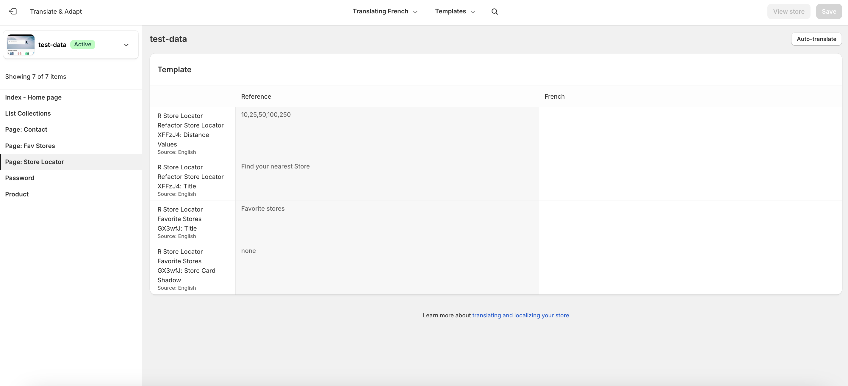
Step 4: Add Translations for Your Favourite Stores Block
To add translations, follow these steps:
- In the theme editor, navigate to R+ Favourite Stores Block, click the (...) menu at the top right corner.
- Select Localize.
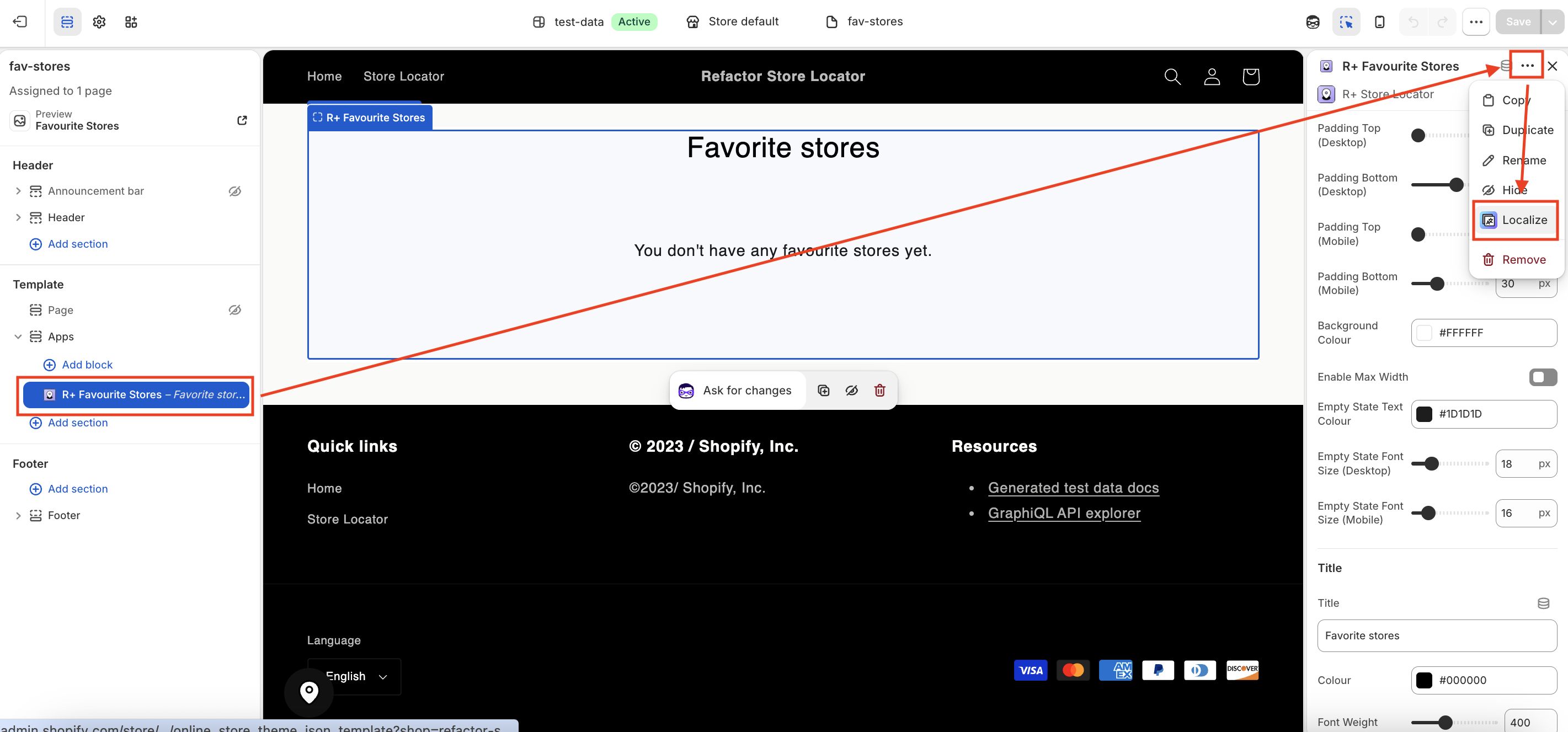
3. You will be redirected to the Translate & Adapt app, where you can edit translations for the languages used in your store.
Do you need help?
If you have any questions or run into issues, please contact us — we’re happy to help.