Customer Accounts (New) Blocks — Settings & Customisation Guide
This guide covers all available settings for the R+ Back in Stock extension, which can be installed as either a Block (embedded in the customer profile page) or a Page (a standalone customer account page). Both versions share identical settings.
Adding the Notify Me Block
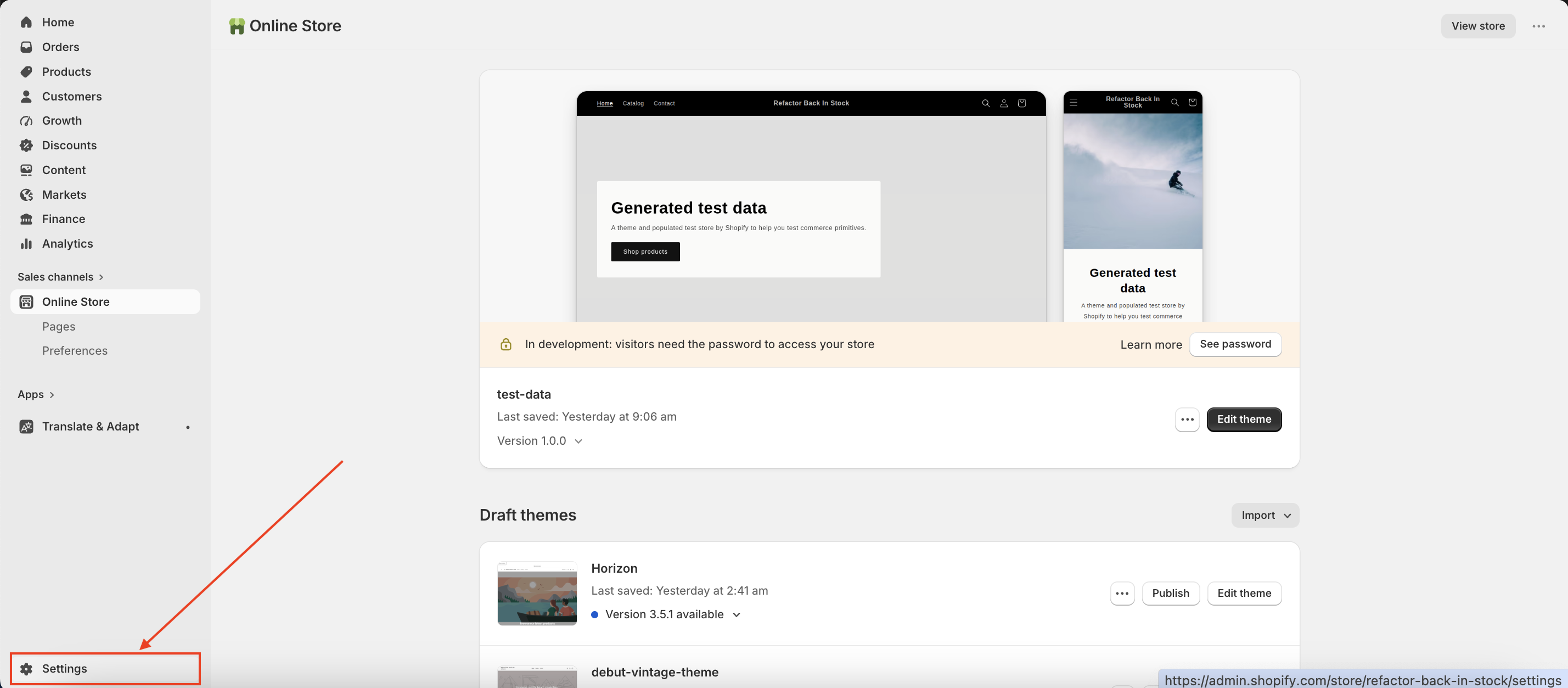
- Go to your store's Admin panel and open Settings.
-
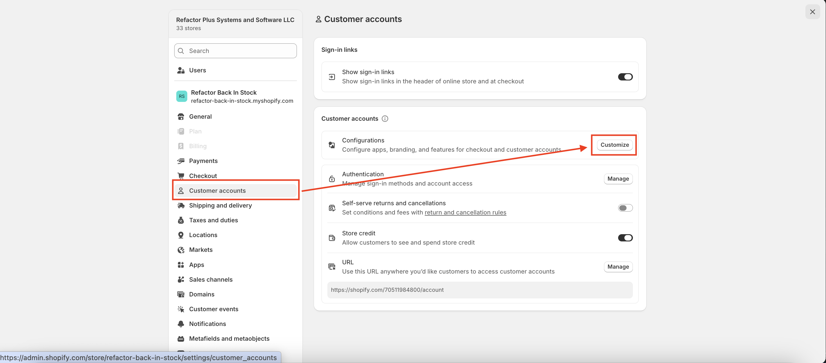
Navigate to Customer Accounts → Configurations → Customize.
-
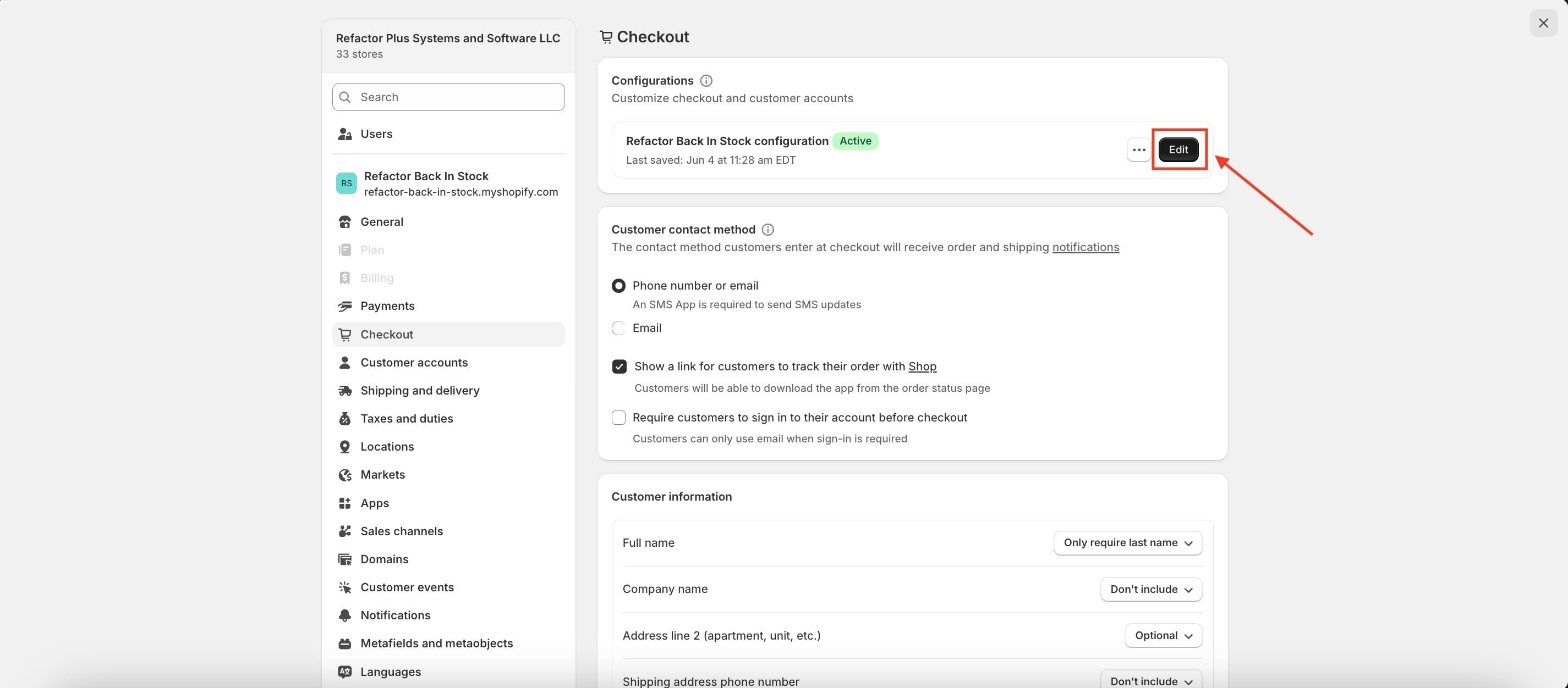
Select the Configuration you want to customize and click Customize again.
-
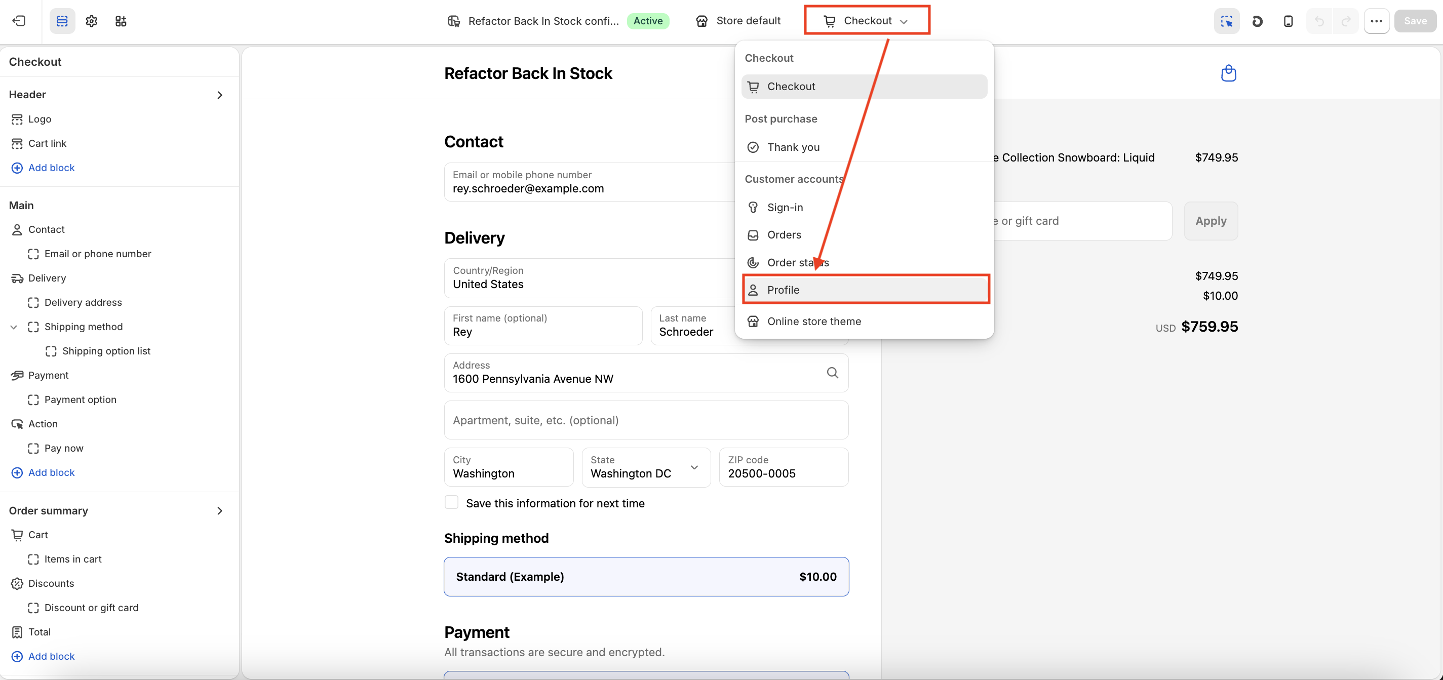
Then the customiser opens, and in the dropdown at the top, choose Customer Accounts → Profile.
-
Click Add Block and select R+ Back In Stock Block.
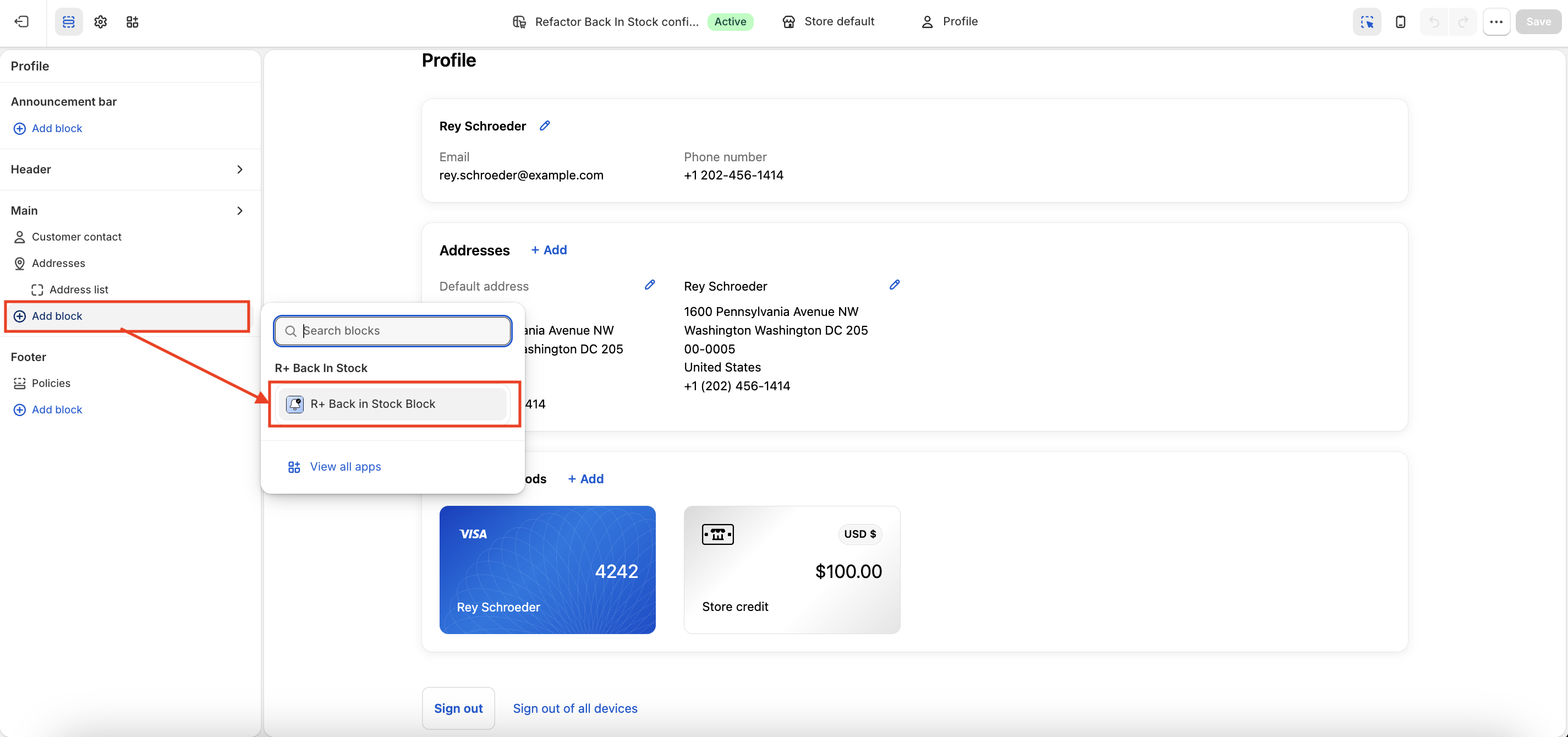
- Click Save.


Adding the Notify Me Block
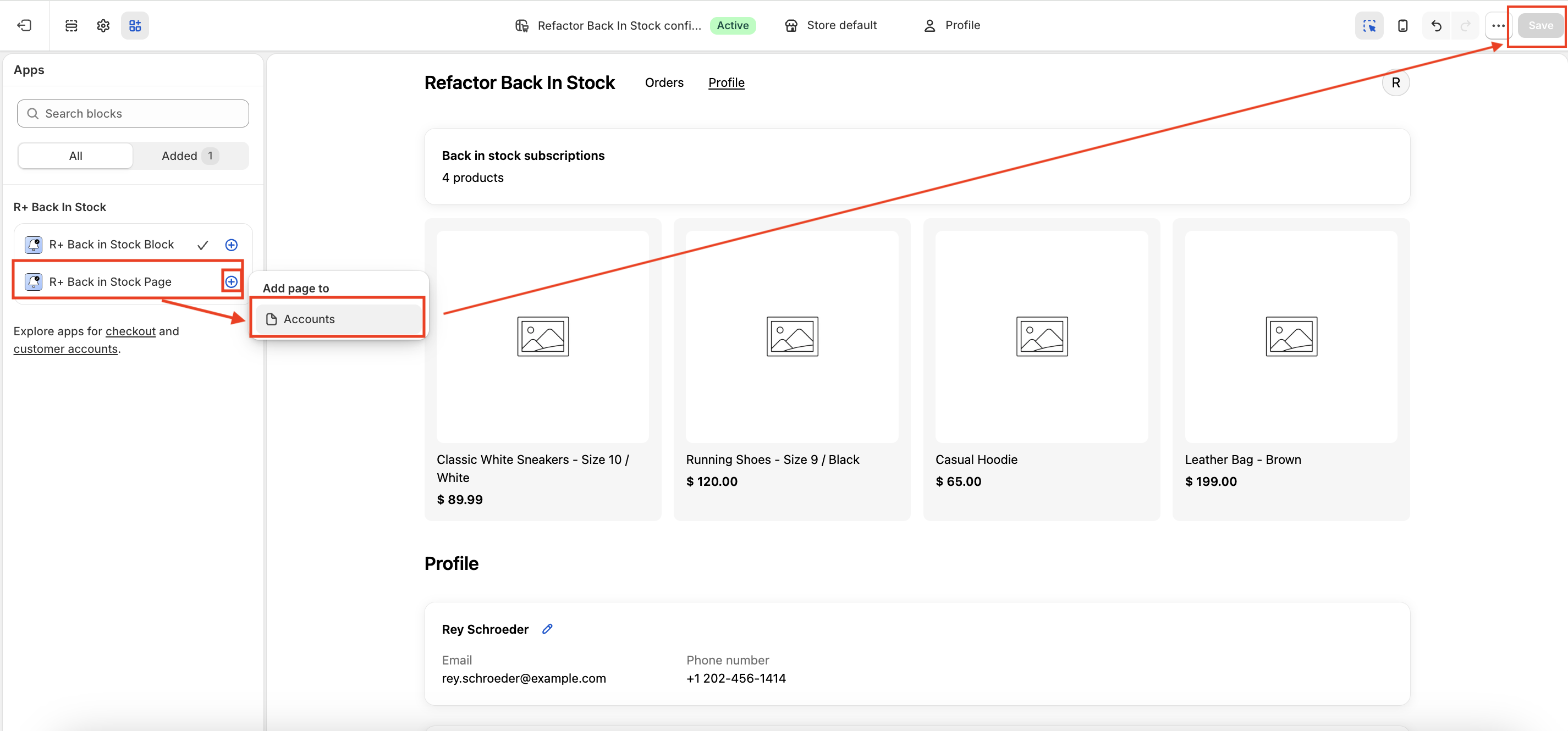
-
In your Admin, go to the Apps tab.
- Find R+ Back in Stock Page in the list.
- Click the + button next to it.
- Under Add page to, choose Accounts.
-
Click Save.
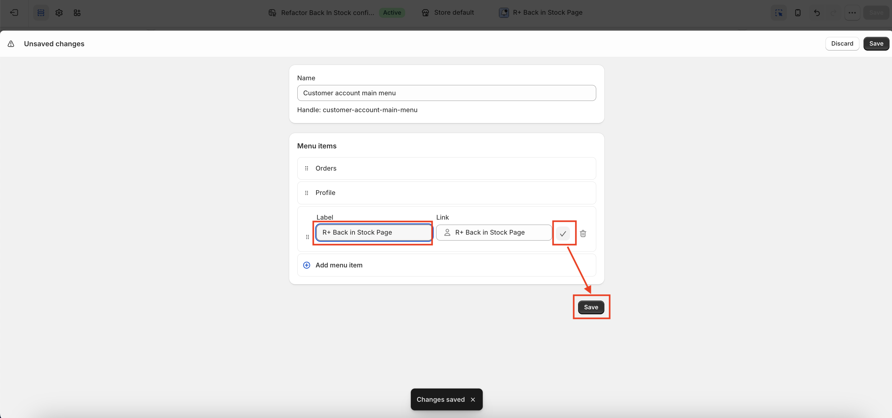
-
A button labeled Add to menu will appear above — click it.
- You will be redirected to the menu editor, where the new page is already listed.
- Click the checkmark (✓) next to the page to add it as a menu item.
-
Click Save.
-
Now you will see the R+ Back in Stock Page link at the account page header.
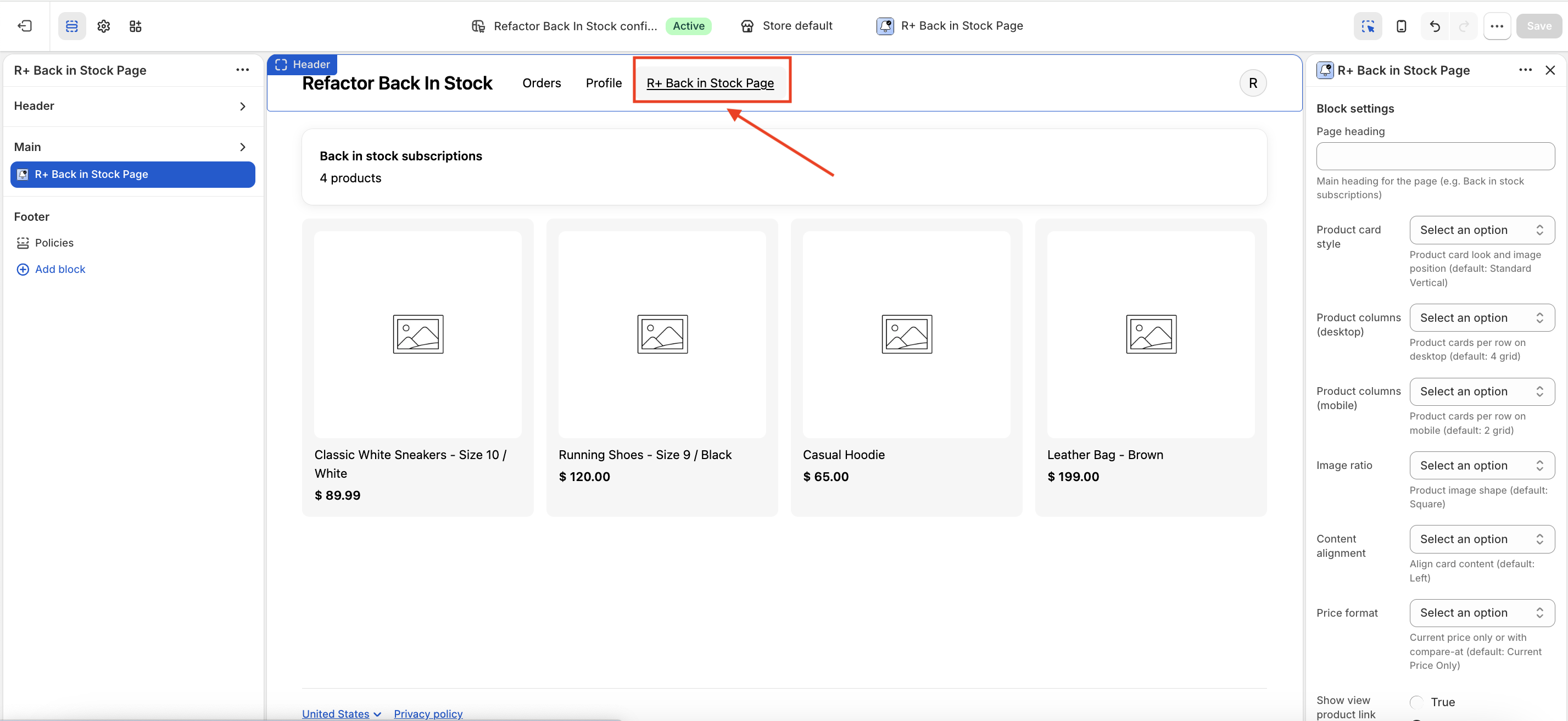


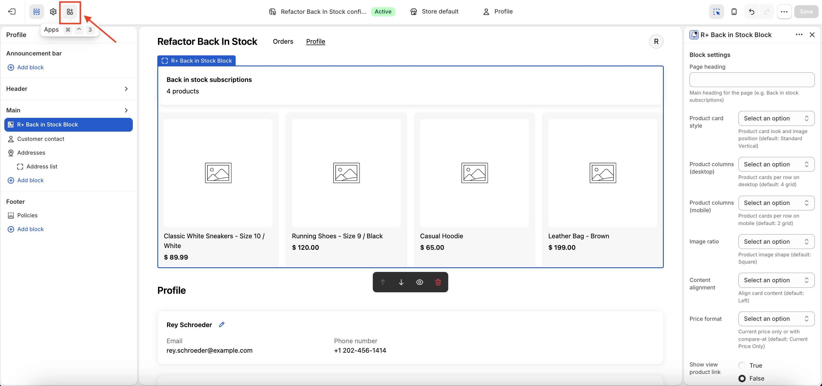
Settings Overview
Page Heading
Setting name: Page heading
Type: Text
Sets the main title displayed at the top of the back-in-stock subscriptions view. Enter any label that fits your brand, for example Back in stock subscriptions or My Notifications.
If left empty, no heading will be shown.
Product Card Style
Setting name: Product card style
Type: Dropdown
Controls both the visual style and the image layout of each product card. There are six options:
- Standard Vertical — Clean card with the image stacked above the product info. This is the default.
- Standard Horizontal — Image sits side by side with the product info.
- Bordered Vertical — Same as Standard Vertical, but with a visible border around the card.
- Bordered Horizontal — Bordered card with a horizontal image and info layout.
- Minimal Vertical — Stripped-down card, image on top, minimal decorative elements.
- Minimal Horizontal — Minimal style with a side-by-side layout.
Product Columns (Desktop)
Setting name: Product columns (desktop)
Type: Dropdown
Determines how many product cards appear per row on desktop screens. Available options: 2 grid, 3 grid, 4 grid. The default is 4 grid.
Product Columns (Mobile)
Setting name: Product columns (mobile)
Type: Dropdown
Determines how many product cards appear per row on mobile screens. Available options: 1 grid, 2 grid. The default is 2 grid.
Image Ratio
Setting name: Image ratio
Type: Dropdown
Controls the aspect ratio of the product image inside each card:
- Square — Equal width and height. Works well for most product types. This is the default.
- Portrait — Taller than wide. Great for apparel and fashion products.
- Landscape — Wider than tall. Suits products like electronics or home goods.
Content Alignment
Setting name: Content alignment
Type: Dropdown
Aligns the text content (product title, price, links) within each card. Options are Left (default), Center, and Right.
Price Format
Setting name: Price format
Type: Dropdown
Controls how product pricing is displayed on the card:
- Current Price Only — Shows only the current selling price. This is the default.
- Compare at Price — Shows both the original (compare-at) price and the current price, useful for highlighting discounts.
Show View Product Link
Setting name: Show view product link
Type: Toggle (on/off)
When enabled, each product card will include a link or button that takes the customer to the product page on your store. Disabled by default.
View Product Style
Setting name: View product style
Type: Dropdown
Defines the visual appearance of the view-product element (only relevant when Show view product link is enabled):
- Link — Plain text link.
- Link with arrow — Text link with a trailing arrow icon. This is the default.
- Button — Solid or outlined button.
- Button with arrow — Button with a trailing arrow icon.
View Product Link Label
Setting name: View product link label
Type: Text
The label text shown on the link or button that leads to the product page. For example: View product, Shop now, or See details.
Show More Button Label
Setting name: Show more button label
Type: Text
When a customer has more subscriptions than the initial display limit, a button appears to load additional products. This setting controls the button's label text, for example Show more or Load more.
Loading Message
Setting name: Loading message
Type: Text
The message displayed while the extension is fetching the customer's back-in-stock subscriptions. For example: Loading your notifications... or Please wait...
Empty Message
Setting name: Empty message
Type: Text
The message shown when the customer has no active back-in-stock subscriptions. For example: You have no active notifications or You haven't subscribed to any products yet.
Notes
All text settings (headings, labels, messages) support custom copy, making it easy to match your store's tone and language. If your store serves multiple languages, keep in mind that these fields currently accept a single value — for multilingual stores, you may want to set generic, language-neutral labels or coordinate with your localization setup.
Do you need help?
If you have any questions or run into issues, please contact us — we’re happy to help.