R+ Back in Stock Helper Block — Settings & Customisation Guide
Overview
The R+ Back in Stock — Helper is an app embed block that loads the back-in-stock-helper.js script across your Shopify storefront. It initializes a global JavaScript API (window.refactor_apps.back_in_stock ) that powers back-in-stock subscription functionality — allowing customers to sign up for restock notifications on out-of-stock product variants.
Once loaded, the block fires a apps:back-in-stock:ready event and exposes a set of methods your theme or custom code can use to subscribe, unsubscribe, and check subscription status.
To activate the extension:
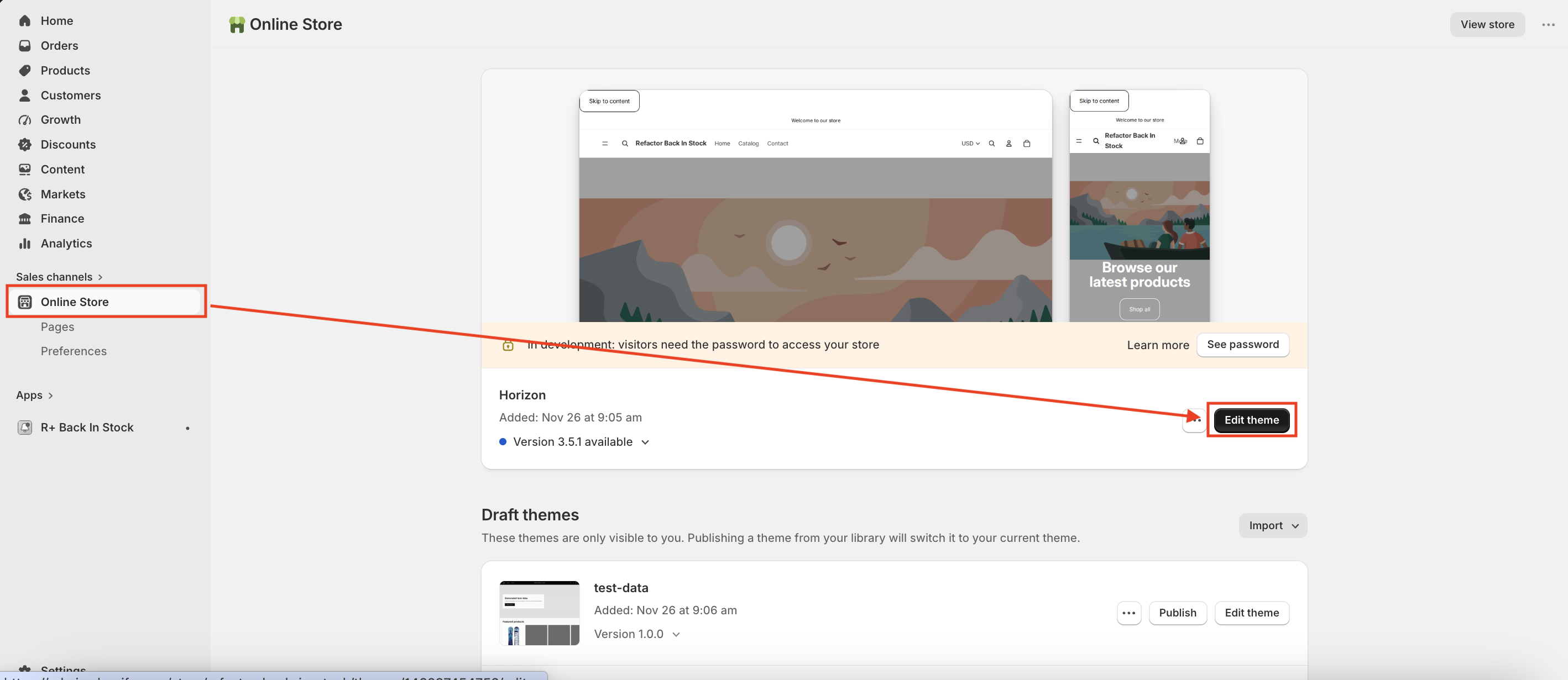
- In your Shopify admin, go to Online Store → Themes.
-
Find the theme you want to edit and click Edit theme.
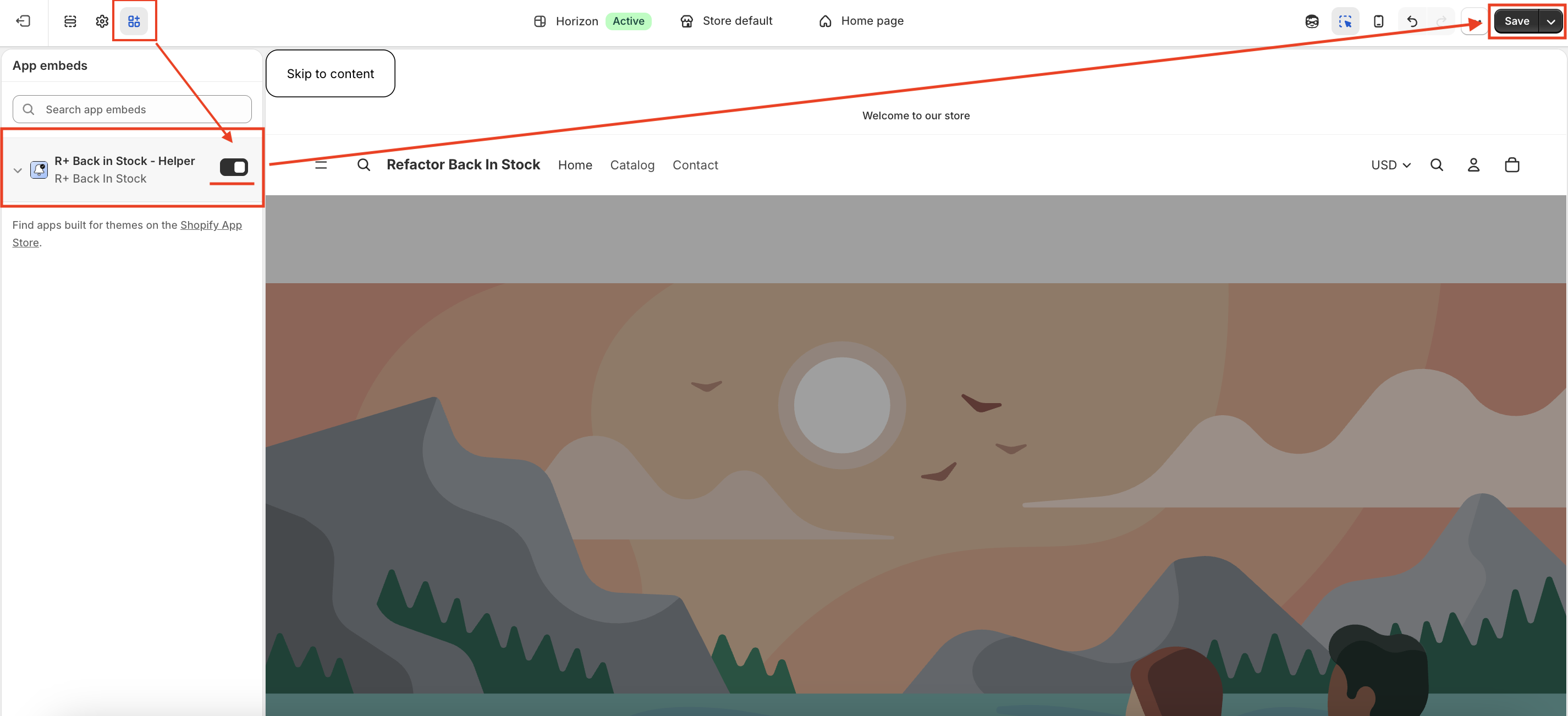
- In the sidebar, click the App embeds icon (the puzzle piece icon in the left sidebar).
- Find R+ Back in Stock - Helper in the list and enable it.
-
Click Save.


What the Block Does
When embedded in your storefront, the Helper block:
- Loads the back-in-stock JavaScript helper on every page
- Registers a global API at
window.refactor_apps.back_in_stock - Fires custom DOM events when customers subscribe or unsubscribe
- Handles the Unsubscribe Page — a dedicated page shown to customers who click an unsubscribe link from a notification email
The Unsubscribe Page is the primary UI component that the block controls visually, and all of the block's settings relate to how that page looks and behaves.
Unsubscribe Page Settings
The block provides three distinct states for the Unsubscribe Page, each fully customisable: Success, Already Unsubscribed, and Error. Beyond that, you can control typography, colors, and the return button.
Success State
Shown when a customer successfully unsubscribes from a product notification.
Show Success Icon — Toggle whether a status icon appears above the message. Enabled by default.
Success Icon Background — The background color of the icon circle. Default: #4ad38c (green).
Success Title — The heading displayed to the customer. Default: "You have been successfully unsubscribed."
Success Message — The supporting text beneath the title. Default: "Your email preferences were updated."
Already Unsubscribed State
Shown when a customer visits the unsubscribe link but is not currently subscribed to any product.
Show Already Icon — Toggle whether a status icon is displayed. Enabled by default.
Already Icon Background — The icon background color. Default: #dec561 (yellow/amber).
Already Title — The heading for this state. Default: "You're already unsubscribed."
Already Message — The body text. Default: "You are not currently subscribed to any product."
Error State
Shown when the unsubscribe request fails due to a technical issue.
Show Error Icon — Toggle the status icon. Enabled by default.
Error Icon Background — The icon background color. Default: #e76464 (red).
Error Title — The heading for the error state. Default: "Something went wrong."
Error Message — The supporting text. Default: "We couldn't process your request. Please try again or contact support."
Typography
All three states share the same title and message styling settings.
Title Color — The color applied to all state headings. Default: #282828 .
Title Size — Desktop — Font size for the title on desktop screens. Range: 12–64px, default 32px.
Title Size — Mobile — Font size for the title on mobile screens. Range: 12–64px, default 26px.
Message Color — The color of the supporting text. Default: #939393 (gray).
Message Size — Desktop — Font size for the message text on desktop. Range: 12–40px, default 16px.
Message Size — Mobile — Font size for the message text on mobile. Range: 12–32px, default 14px.
Page Background
Background Color — The background color of the entire unsubscribe page. Default: #eceef0 (light gray).
Return Button
After seeing any of the three states, customers are presented with a button to return to the store.
Button Text — The label on the button. Default: "Return to store."
Button Background — The fill color of the button. Default: #000000 (black).
Button Text Color — The color of the button label. Default: #ffffff (white).
Button Border Radius — Controls how rounded the button corners are. Range: 0–50px, default 6px.
Button Font Size — Desktop — Font size of the button label on desktop. Range: 12–32px, default 14px.
Button Font Size — Mobile — Font size of the button label on mobile. Range: 12–28px, default 12px.
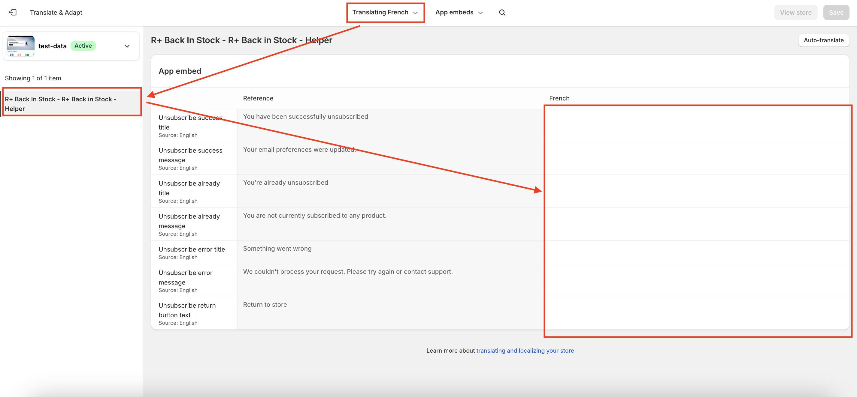
Add Translations for Your R+ Back in Stock Helper Block
To add translations:
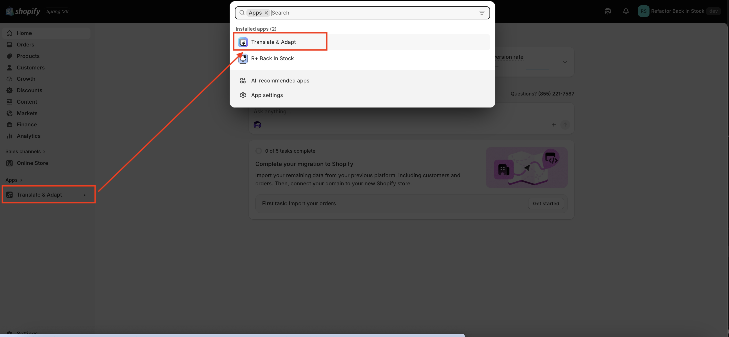
-
Go to Translate & Adapt App.
-
Select App embeds.
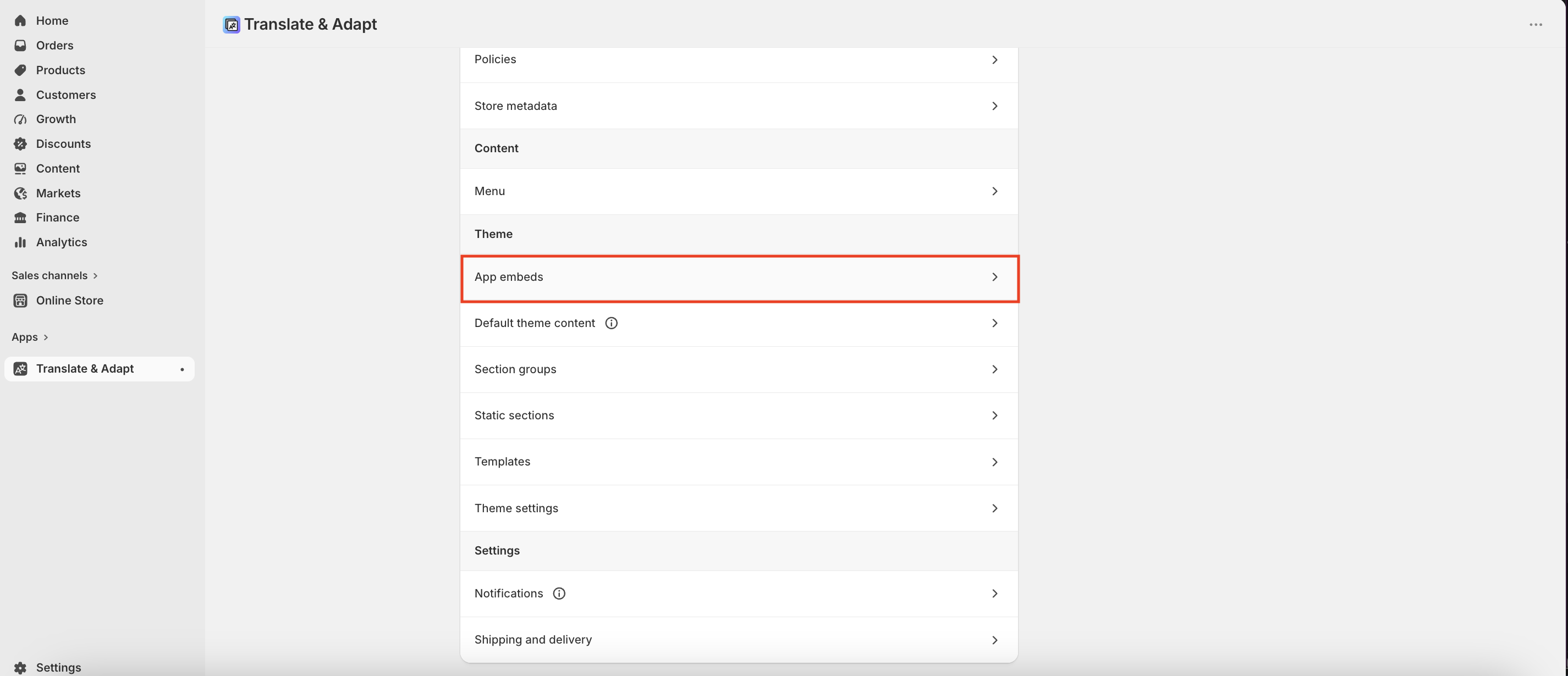


3. You will be redirected to the Translate & Adapt app, where you can edit translations for the languages used in your store.
JavaScript API Reference
The Helper block also exposes a global API for developers who want to integrate back-in-stock functionality into their theme code. All methods are available at window.refactor_apps.back_in_stock once the block has loaded.
checkIsSubscribed({ email, variantId }) — Checks whether a given email is subscribed to notifications for a specific variant.
checkIsSubscribedByCustomerId({ customerId, variantId }) — Same check, but using a Shopify customer ID instead of an email address.
subscribeOnTheProduct({ variantId, email, customerId }) — Subscribes a customer to restock notifications. Optionally links the subscription to a customer account. Fires the apps:back-in-stock:subscribed DOM event on success.
unsubscribeFromTheProduct({ variantId, email, customerId }) — Removes a subscription by email and variant. Fires apps:back-in-stock:unsubscribed on success.
unsubscribeFromTheProductByCustomerId({ variantId, customerId }) — Removes a subscription using only a customer ID (no email required).
getSubscribers({ variantId }) — Returns a list of all subscribers for a given variant. Intended for admin or advanced use cases.
getSubscribedProducts({ customerId }) — Returns all variant IDs that a customer is currently subscribed to.
You can also listen for readiness before calling any method:
document.addEventListener("apps:back-in-stock:ready", () => { // safe to call window.refactor_apps.back_in_stock methods here });
Do you need help?
If you have any questions or run into issues, please contact us — we’re happy to help.